

Abstract
Assessments of the impacts of climate change are typically made using climate scenarios based on assumptions about future emissions of greenhouse gases, but policymakers and climate risk communicators are increasingly asking for information on impacts at different levels of warming. This paper provides this information for a set of indicators of climate risks in the UK for levels of warming up to 4 °C above pre-industrial levels. The results show substantial increases in climate risks at 2 °C, which is often inferred in the media to be a 'safe' level of climate change. In a 2 °C world, the chance of a heatwave is doubled, and the frequency of heat stress affecting people, crops and animals can be increased by a factor of five. Cooling degree days more than double, wildfire danger can increase by 40%–70%, the frequency of agricultural and water resources droughts doubles in England, and flood frequency in Wales increases by 50%. At 4 °C the increases in risk are considerably greater: heatwaves occur in virtually every year. The frequency of cold weather extremes reduces, but is not eliminated, with increasing warming. The rate of change in an indicator with warming varies across the UK. For temperature-based indicators this reflects variability in current climate, but for rainfall-based indicators reflects variations in the change in climate. Most indicators show a generally linear increase in risk with level of warming (although the change in risk from now is around 2.4 times higher in a 4 °C world than a 2 °C world because of warming experienced so far). However, some indicators—particularly relating to heat extremes—show a highly non-linear increase with level of warming. The range in change in indicator at a given level of warming is primarily caused by uncertainty in the estimated regional response of to increasing forcing.
Export citation and abstract BibTeX RIS

Original content from this work may be used under the terms of the Creative Commons Attribution 4.0 licence. Any further distribution of this work must maintain attribution to the author(s) and the title of the work, journal citation and DOI.
This article was updated on 13 October 2021 to correct the formatting of table 2.
1. Introduction
Most climate impact assessments use climate scenarios based on projections of future emissions and evaluate impacts and climate risks at specific time periods. However, users are increasingly interested in the effects of climate change at different levels of warming, rather than at specific times (e.g. Brown, 2020). The IPCC's Fifth Assessment Report, for example, summarised regional impacts against levels of warming (IPCC 2014a). Focusing on levels of warming also reduces the effect of uncertainties in the rate of climate change on estimated impacts, and turns attention to when a given warming level might be reached.
A small but increasing number of studies have looked explicitly at impacts at different levels of warming (e.g. Seneviratne et al (2016), Naumann et al (2018), Arnell et al (2019), Ebi et al (2018) at the global scale and Vautard et al (2014), Kjellstrom et al (2018) and Tobin et al (2018) in Europe), sometimes concentrating on just one level of warming (such as 2 °C). These studies have mostly used a time-sampling approach to identify periods when the global average temperature increase corresponds to defined levels of warming. However, there have been relatively few studies in the UK (e.g. Arnell 2011, Kennedy-Asser et al 2021, Hanlon et al 2021, Rudd et al in review).
This paper presents a series of policy-relevant indicators of climate risk across the UK calculated for different levels of global warming relative to pre-industrial levels, using UKCP18 climate projections (Lowe et al 2018). 'Climate risk' is here interpreted as the 'potential for adverse consequences on lives, likelihoods, health, ecosystems and species, economic, social and cultural assets, services and infrastructure' (IPCC 2014b). This is a function of climate hazard, exposure and vulnerability (IPCC 2012), all of which change into the future. The indicators are all based on current policy-relevant thresholds for climate hazards or resources, beyond which warnings are issued, operational plans implemented, or impacts are known to increase significantly. The indicators do not in themselves measure impact in terms of losses to health, livelihoods, the economy or the environment, but can mostly be interpreted as indicators of risk because the thresholds and specific definitions are based on current perceptions of exposure and vulnerability.
Different users have different requirements for information on climate risk (Arnell et al 2021a). At the highest most strategic level (for example national), climate policymakers require information on how a range of indicators relevant to national policy vary with level of warming. This helps to frame the climate change challenge and to inform prioritisation, and information can be presented at the national scale to give an overview of the magnitude of change in risk. Local authority climate policymakers seeking to develop local climate mitigation and adaptation policy need information at a finer spatial resolution, but again can use generalised policy-relevant indicators (perhaps tailored to local priorities). Both these sets of users could use either central estimates of risk at different levels of warming, or 'worst case' estimates, and information on risks in rather abstract '2 degree worlds' or '4 degree worlds' would be useful. Policymakers seeking to develop sector adaptation and resilience policies require more sector-specific indicators at a finer spatial resolution (to capture regional variability in risk), need to consider carefully whether to focus on central or 'worst case' estimates, and probably also need information on how risks change over time. This paper provides information most relevant to high-level national, regional and local climate policymakers seeking to characterise climate risks at different levels of warming to inform climate mitigation and adaptation policy. It also examines the shape of the relationship between level of warming and impact, and how it varies between indicators. The paper does not attempt to evaluate the significance or relative importance of the different risks considered: instead, it provides information to allow policymakers to do this.
Indicators are presented for levels of warming up to 4 °C above pre-industrial levels. For context, the 2020 UNEP Emissions Gap report (UNEP, 2020) estimated that current emissions trajectories and policies would lead to an increase in global average temperature greater than 3 °C by 2100, and the highest emissions scenarios (RCP8.5 and the latest version ssp585) used to run climate models suggest increases in temperature of up to 5 °C (Nicholls et al 2020). The paper complements estimates of the same indicators over the 21st century under different emissions scenarios (Arnell et al 2021a).
2. Methods
2.1. Introduction to the approach
The set of indicators of climate risk is calculated from time series of daily weather data from 1981 to 2100 at a spatial resolution of 12x12km (1km for the hydrological indicators), and average indicators are extracted for periods corresponding to specific increases in global mean surface air temperature above pre-industrial levels. The gridded values are then averaged to construct averages by UK nation (England, Wales, Scotland and Northern Ireland) and region (figure 1). The time series of daily weather data are constructed using HadUK-Grid observations with changes in climate taken from UKCP18 climate projections applied using a transient implementation of the delta method. A time-sampling approach (Vautard et al 2014, James et al 2017) is used to identify the time periods with specific temperature increases. These stages are outlined in more detail in sections 2.3.2 and 2.3.3.

Figure 1. UK regions.
Download figure:
Standard image High-resolution image2.2. Indicators of climate risk
The indicators of climate risk are summarised in table 1 with details of calculations given in Supplementary Material (available online at stacks.iop.org/ERC/3/095005/mmedia). The indicators are broadly the same as those presented in Arnell et al (2021a). Each indicator represents some dimension of climate hazard or resource, and does not explicitly characterise actual impact in terms of some measure of loss or damage. This actual impact is a function not only of hazard and resource, but also exposure to loss and vulnerability (the propensity to suffer harm). These latter two drivers depend on current and future socio-economic characteristics, whilst change in hazard and resource are largely driven by climate change. The indicators of hazard and resource calculated here are mostly based on current critical policy or alert thresholds—as outlined below - and these thresholds typically represent current exposure and vulnerability so the indicators can be interpreted as characterising one aspect of climate risk. The thresholds are assumed fixed here, but in practice will change in the future with adaptation.
Table 1. Summary of climate risk indicators.
| Indicator | Definition | Reference | Specific metric used | Regional weighting |
|---|---|---|---|---|
| Health and well-being | ||||
| Met Office heatwave | Maximum temperature above region-specific thresholds for at least three days | McCarthy et al (2019) | Annual likelihood of at least one heatwave threshold reached | 2011 population |
| Heat-health warnings ('Amber alerts') | Maximum and minimum temperatures above region-specific thresholds for at least two days | Public Health England / National Health Service (2019) | Annual likelihood of at least one alert threshold reached | 2011 population |
| Cold weather warnings ('Amber alerts') | Average temperature below 2 °C for at least two days. | Public Health England / National Health Service (2018) | Annual likelihood of at least one alert threshold reached | 2011 population |
| Heat-stress days | Wet Bulb Globe Temperature (WBGT) in the shade greater than 25 | Morabito et al (2019) | Annual likelihood of at least one day | 2011 population |
| Energy use | ||||
| Heating degree days | Heating degree days relative to 15.5 °C | Azevedo et al 2015 | Average annual °C-days | 2011 population |
| Cooling degree days | Cooling degree days relative to 22 °C | Azevedo et al 2015 | Average annual °C-days | 2011 population |
| Transport | ||||
| Transport network risk: 26 °C | Maximum temperature above 26 °C | Chapman (2015), RSSB (2013) | Mean number of days/year | Length of railway network |
| Rail network risk: 30 °C | Maximum temperature above 30 °C | RSSB (2013), Palin et al (2013) | Mean number of days/year | Length of railway network |
| Railway adverse weather days | Max temperature above 25 °C, or min temperature below −3 °C, or daily rainfall > 40mm, or snow depth > 50mm. | Network Rail (2020) | Mean number of days/year | Length of railway network |
| Road accident risk | Minimum temperature below 0 °C | Mean number of days/year | Length of road network | |
| Agriculture | ||||
| Growing season length | Days between start of growing season and first of five consecutive days with average temperature <5.6 °C | Rivington et al (2013), Harding et al (2015) | Average annual day | Area of cropland and improved grassland |
| Growing degree days | Sum of degrees above 5.6 °C during the thermal growing season | Rivington et al (2013) | Average annual °C-days | Area of cropland and improved grassland |
| Start of field operations (Tsum200) | Day when the accumulated temperature from 1st January exceeds 200 °C | Harding et al (2015) | Average annual day | Area of cropland and improved grassland |
| Potential Soil Moisture Deficit (PSMD) | Annual maximum potential soil moisture deficit, calculated from potential evaporation minus precipitation | Knox et al (2010), Daccache et al (2012) | Average annual value (mm) | Area of cropland and improved grassland |
| Agricultural drought risk (SPI) | Time with the Standardised Precipitation Index (SPI) < −1.5. SPI calculated over 3 months | Bachmair et al (2018) | Proportion of time | Area of cropland and improved grassland |
| Agricultural drought risk (SPEI) | Time with the Standardised Precipitation Evaporation Index (SPEI) < −1.5. SPEI calculated over 6 months | Parsons et al (2019) | Proportion of time | Area of cropland and improved grassland |
| Wheat heat stress during anthesis | Days between 1 May and 15 June with maximum temperature greater than 32 °C | Jones et al (2020) | Annual likelihood of at least one day | Area of cropland |
| Heat stress effects on milk yield | Days with Temperature Humidity Index > 70 | Dunn et al (2014) | Mean number of days/year | Area of improved grassland |
| Wildfire | ||||
| MOFSI 'very high' fire danger | Days with the Met Office Fire Severity Index greater than the 'very high danger' threshold | Arnell et al (2021b) | Mean number of days/year | Area of heathland, bog, Marsh and grassland |
| Daily Hazard Assessment amber warming | Days with the components of MOFSI greater than the seasonal thresholds | Arnell et al (2021b) | Mean number of days/year | Area of heathland, bog, Marsh and grassland |
| Hydrological | ||||
| Severe hydrological drought | Time with the Standardised Streamflow Index (SSI) < −1.5, accumulated over 12 months | Barker et al (2016), Svensson et al (2017) | Proportion of time | Not weighted |
| Flood likelihood | Likelihood of experiencing the current 10-year peak flow | Kay et al (2021) | Annual likelihood of experiencing the 1981–2010 10-year peak flow | Not weighted |
| Flood magnitude | Magnitude of the 10-year return period peak flow | Kay et al (2021) | % change in magnitude | Not weighted |
See Supplementary Material for details on calculations
The indicators are all averaged to the national and regional scales (figure 1), weighted as appropriate by population, transport network or land cover (indicators have also been calculated at finer spatial resolutions—not shown). Most of the indicators are based on absolute thresholds (the exceptions are the drought and river flood indicators which are based on local percentiles), and there can be considerable variability within a region due to variability in current climate regime. The national and regional averages are therefore to be regarded as indicative: some parts of a region will have larger changes, and others smaller.
No attempt is made here to represent the significance of a future value of an indicator, or a change in an indicator through, for example classification into low, medium or high categories. 'Significance' has to be defined in relation to risk appetite or tolerance of change. It depends on context and stakeholder, and may change over time. Also, no attempt is made to evaluate the relative importance of different indicators and climate risks.
2.2.1. Health and well-being
Four indicators characterise risks to human health from extreme heat (Arnell and Freeman 2021a). One is based on the definition of a heatwave as used by the Met Office (McCarthy et al 2019) primarily for public communications purposes: this uses temperature thresholds which vary across the UK. The second is based on the amber heat-health alert warnings which trigger the implementation of heatwave emergency plans by health and social care providers in England (Public Health England / National Health Service (2019), Sanderson and Ford 2016), and the third is based on corresponding warnings which trigger cold weather emergency plans (Public Health England / National Health Service 2018). All three are here expressed as the annual chance that a warning is triggered, averaged across a region. In practice, warnings are typically issued on the basis of the temperature thresholds being crossed somewhere in a region so actual declarations occur more frequently than implied here. The fourth indicator is a measure of occupational heat stress, dependent on temperature and humidity and indexed by Wet Bulb Globe Temperature (WBGT). It is here characterised by the annual chance of having a WBGT in the shade greater than 25 °C. This threshold is similar to the threshold of 27 °C in the Sun used in the European HEAT-SHIELD occupational warning system (Morabito et al 2019), above which increasing work breaks are recommended.
2.2.2. Energy use
Heating and cooling degree days are proxies for heating and cooling energy demand, and are calculated using thresholds of 15.5 and 22 °C respectively currently used in the UK (Azevedo et al 2015, Wood et al 2015). At the building scale, heating and cooling degree days are used in building and energy design and management. At the aggregate scale, they are used as indicators of system-scale demand for energy. Hanlon et al (2021) also calculated these indicators, using the same definitions.
2.2.3. Transport
Two of the transport indicators are based on critical thresholds for road and railway infrastructure performance. A daily maximum temperature of 26 °C is a proxy for road surface temperatures above 50 °C which can cause road surfaces to rut and melt (Chapman 2015), and above a daily maximum temperature of 30 °C the number of operational incidents involving track, power and signalling systems is known to increase 'very significantly' on the railway (RSSB 2013). The third transport indicator is the number of defined 'adverse weather days' when temperature, rainfall, snow or wind exceed specified thresholds (Network Rail 2020): punctuality standards for rail operating companies are relaxed on such days. The fourth transport indicator characterises the number of days with increased risk of road traffic accidents due to icy conditions.
2.2.4. Agriculture
The agro-climate indicators are widely-used proxies (Rivington et al 2013) for crop and livestock productivity (see Arnell and Freeman (2021b) for a wider range). The thermal growing season starts when average temperatures exceed 5.6 °C, and growing season length is the time from the start of the thermal growing season to when average temperatures fall below 5.6 °C. Growing degree days (above 5.6 °C) are a measure of the productivity of permanent grassland and the potential for annual crops (and were also calculated by Hanlon et al 2021). The start of field operations is a proxy for the earliest date in the year when a field might be usefully worked (Harding et al 2015): it is the date when accumulated temperatures reach 200 °C (Tsum200), and is commonly used by farmers as a rule of thumb for when to apply fertiliser to grass. Potential soil moisture deficit (PSMD) is a measure of crop demand for water and hence the potential need for supplemental irrigation. It is calculated as the largest cumulative difference during the year between potential evaporation and rainfall (Knox et al 2010, Daccache et al 2012). Drought is characterised using both the Standardised Precipitation Index (SPI) accumulated over 3 months and the Standardised Precipitation Evaporation Index (SPEI), accumulated over 6 months: the SPI is based on just precipitation, whilst the SPEI is calculated from the difference between precipitation and potential evaporation. A 'severe drought' occurs when the SPI or SPEI is less than −1.5, which occurs by definition 6.7% of the time over the 1981–2010 reference period. These indicators correlate well with observed agricultural drought impacts in the UK (Bachmair et al 2018, Parsons et al 2019).
Crop growth can be restricted by extreme temperatures: this is here characterised by the annual chance of having a day during the wheat flowering period (anthesis) with maximum temperature greater than 32 °C (Jones et al 2020). High temperatures can also reduce milk yield from dairy cattle (Dunn et al 2014, Fodor et al 2018), here represented by the number of days with a Temperature Humidity Index (THI) greater than 70 (equivalent to an average temperature of around 21 °C with a relative humidity of 75%).
2.2.5. Wildfire
Wildfire hazard is represented by the number of days with a 'very high' danger level as characterised by the Met Office Fire Severity System (MOFSI: see Arnell et al 2021b), and by the number of days when an amber warning of severe wildfire conditions would be issued by the Daily Hazard Assessment (DHA) prepared by the Natural Hazards Partnership (Hemingway and Gunawan, 2018). MOFSI is used to inform restrictions on public access to specific types of land, and is similar to fire warning systems used in Canada, Europe and New Zealand. The DHA—which covers a wide range of hazards - is used by emergency planners. The wildfire indicators do not represent the actual frequency of wildfires, but rather the frequency of conditions conducive to wildfire (wildfire danger). The timing and location of actual wildfires is an interaction between wildfire danger and sources of ignition.
2.2.6. Water: floods and droughts
The final three indicators characterise the effect of climate change on river flood risk and water resources drought (Kay et al 2021). Flood and drought risk are in practice heavily dependent on infrastructure and management procedures in place, so three proxy indicators are used here. River flood risk is characterised by (i) the change in the magnitude of the 10-year return period flood (a proxy for the size of a flood, given that one occurs) and (ii) the annual likelihood of the reference period (1981–2010) 10-year return period flood (a proxy for the chance of experiencing a flood). Water resources drought is characterised by the proportion of time that the Standardised Streamflow Index (Barker et al 2015, Svensson et al 2017) is classed as 'severe' (below −1.5), which is a proxy for water resources drought. The flood and water resources drought indicators are calculated across Great Britain using the UKCEH Grid-to-Grid model (G2G: Bell et al 2009, 2016), a national-scale rainfall-runoff and routing model that is widely used for hydrological simulation. It was not run for Northern Ireland.
2.3. Climate scenarios
2.3.1. Observed climate data
The HadUK-Grid observational data set (Met Office 2018a, 2018b, Hollis et al 2019) was used to represent current climate, with 1981–2010 used as the climate reference period. The global average temperature over the period 1981–2010 was 0.61 °C warmer than the pre-industrial average (from HadCRUT4: Morice et al 2012). The hydrological indicators used the 1km resolution daily temperature and precipitation from HadUK-Grid, with 40km resolution potential evaporation taken from MORECS (Hough and Jones, 1997). The other indicators use daily temperature (maximum and minimum) and precipitation from the 12km HadUK-Grid data set, together with daily windspeed and relative humidity from ERA5 reanalysis (Copernicus Climate Change Service C3S (2017)) rescaled to match the 12km HadUK-Grid monthly mean windspeed and relative humidity. Daily sunshine hours—used in the calculation of potential evaporation at the 12km resolution - were interpolated from the monthly HadUK-Grid means.
2.3.2. Construction of climate scenarios
Projections for change over the 21st century in monthly temperature, precipitation, vapour pressure, cloud cover and windspeed were taken from the UKCP18 global strand RCP8.5 climate projections (Lowe et al 2018). These are at a spatial resolution of 60 × 60 km and consist of two ensembles of projections. One ensemble comprises 15 variants of HadGEM3-GC3.05, with different plausible parameter values (a perturbed-parameter ensemble). The other set comprises 12 climate models taken from the CMIP5 multi-model ensemble and represents model structural uncertainty. Each ensemble member is an internally-consistent projection of coherent changes over time and space in all relevant climate variables. The HadGEM3-GC3.05 projections generally produce larger increases in temperature with RCP8.5 forcing than the CMIP5 ensemble, and greater reductions in rainfall in summer and autumn across England and Wales (Murphy et al 2019). The two ensembles, therefore, produce qualitatively different sets of change in climate risk indicator for a given emissions scenario (Arnell et al 2021a).
The climate projections were applied to the daily observed data using a transient implementation of the delta approach, using the following stages (figure 2: Arnell et al 2021a):
- (i)For a given ensemble member, month and location, the time series of monthly mean climate variable (monthly total for precipitation) is expressed as an anomaly from that member's simulated average monthly value over the model 1981–2010.
- (ii)The time series of monthly anomalies are smoothed using a 31-year running mean to filter out the effects of year-to-year variability and isolate the climate change signal. In order to calculate the smoothed anomalies to 2100, the anomaly time series were extrapolated beyond 2100 using linear regression. This stage produces time series of annual anomalies relative to 1981–2010 for each month.
- (iii)The time series of monthly anomalies were then interpolated to produce daily anomalies, in order to minimise large step changes from one month to another. This is most apparent for temperature—where there can be large differences in anomaly from one month to the next—and this stage was not applied when constructing the time series used for hydrological modelling.
- (iv)A long reference time series was constructed by repeating the 1981–2010 observed daily time series three more times to 2100, and the time series of anomalies applied to produce a perturbed time series from 2011 to 2100. The period 1981–2010 is therefore identical for all climate scenarios.
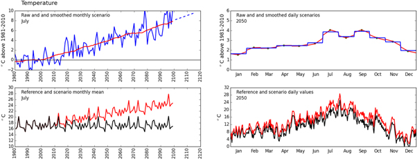
Figure 2. Illustration of the method used to construct climate scenarios (Reprinted from Arnell et al 2021a, Copyright (2021), with permission from Elsevier). (a) Original UKCP18 anomaly for change in climate variable in one month, interpolated change (dotted line) and 31-year running mean. (b) Monthly anomaly and interpolated daily anomaly, for a sample year. (c) Repeated reference time series (black) and series with running mean anomaly applied (red), for month. (d) Reference and daily climate variable, for a sample year. The example uses mean temperature for a location in southern England; plots (a) and (c) show July as an example month, and (b) and (d) show 2050 as an example year.
Download figure:
Standard image High-resolution imageThis transient application of the delta method assumes that there is no change in relative variability in climate from year to year, and also that the shape of the distribution of a climate variable does not change. Both of these assumptions may be invalid in detail, although effects are likely to be small compared with the variation between the ensemble members.
A delta approach perturbing observed daily data with monthly anomalies was adopted, rather than use directly the daily time series available for the UKCP18 global strand, for both conceptual and practical reasons. Observed data is used to characterise the current climate because this observed experience is familiar to stakeholders, and the pattern of year-to-year variability is realistic at least over the reference period. The UKCP18 daily projections potentially include information on changes in day to day and year to year variability, but the robustness of these projected changes will be influenced by bias in model estimates of mean and variability. This bias needs to be removed from the daily projections, but different bias adjustment techniques adjust for different aspects of bias and could give different results and there are known limitations to bias adjustment (e.g. Maraun et al 2017). At the most practical level, the UKCP18 global strand daily projections are only available at a 60 × 60 km resolution, and this is too coarse to capture the spatial variability in temperature and rainfall across the UK which affect variability in climate hazard and resource. The delta method is therefore a simple and pragmatic approach to the creation of plausible future climates for a large number of locations and climate projections.
2.4. Time periods corresponding to specific increases in temperature
The value of each climate risk indicator for a given increase in mean global surface air temperature (GSAT) above pre-industrial levels was calculated here over the 30-year time period in the 1981 to 2100 time series when the mean global average surface air temperature first exceeds that temperature. This year varies between the ensemble members (figure 3, Supplementary Material). All 15 members of the HadGEM3-GC3.05 ensemble reached at least 4.5 °C above pre-industrial levels by 2100. A 30-year mean temperature increase of 2 °C was reached in the 30-year periods starting between 2012 and 2018 (median 2015), and 3 and 4 °C increases were reached in the periods starting between 2029 and 2037 (median 2033) and 2042 and 2053 (median 2048) respectively. In contrast, few of the CMIP5 ensemble members produced 30-year mean increases reaching 4 °C by 2100: the lowest member only reached a 30-year mean increase of 2.5 °C even with the high RCP8.5 forcing. In order to ensure that the same sample of models was used for each increase in temperature, only the five CMIP5 models reaching 4 °C were therefore retained in the analysis.
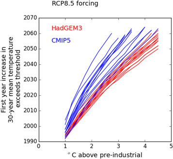
Figure 3. First year of the 30-year period when the 30-year mean change in global mean temperature exceeds a specified increase. The lines show the individual members from the HadGEM3 and CMIP5 UKCP18 global strand ensembles, with RCP8.5 forcing.
Download figure:
Standard image High-resolution imageThree factors complicate the relationship between global average temperature change and local or regional impact. First, the regional change in climate associated with a given increase in global mean temperature may potentially be affected by the spatial pattern of forcing which leads to that increase—in particular the spatial distribution of aerosol emissions. Second, different components of the climate system respond to a forcing at different rates: those controlled by change in the state of the ocean evolve at a slower rate than those primarily determined by changes in atmospheric CO2 concentrations and energy budget (see for example Zappa et al 2020). The relationship between global average temperature change and local impact therefore may depend on the rate of temperature change. However, in practice the effects of these two complications on temperature and precipitation are small relative to the range across different climate models (Maule et al 2017, Good et al 2016). They may be larger for climate features strongly determined by changes in atmospheric dynamics, such as storms or intense precipitation, but these are not represented in the indicators included here. The third complication is that the estimated regional change over time in a climate model simulation may be sensitive to initial conditions and the effects of internal climatic variability: this would add noise to the relationship between global average temperature and local climate change. This potential complication is minimised here through the use of smoothed climate anomalies to construct delta changes applied to observed climate data, and in practice the relationships between global average temperature change and change in UK temperature and rainfall for the individual models are smooth (Supplementary Material).
3. Change in climate across the UK at different levels of warming
Relationships between change in global average temperature and national average seasonal temperature and precipitation change are shown in figure 4 (changes by region are given in Supplementary Material). The national changes are all relative to the 1981–2010 reference period, which is 0.61 °C warmer than the pre-industrial (1850–1900) average. The plots show the median plus the range for the 15 HadGEM3 and 5 CMIP5 ensemble members separately.
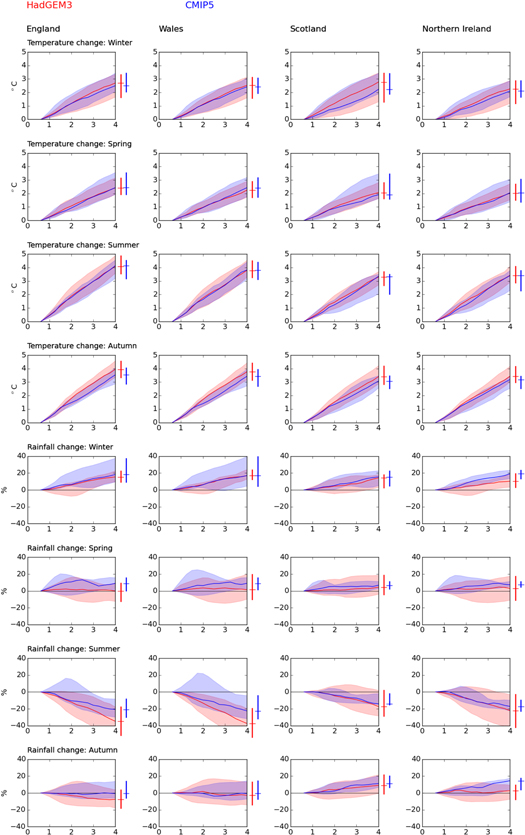
Figure 4. Change in national temperature and precipitation with increase in global mean temperature relative to pre-industrial levels. The changes in national temperature and precipitation are relative to the 1981–2010 average. The plots show the median and the range across the HadGEM3 and CMIP5 ensembles separately: the CMIP5 ensemble consists only of the models which reach an increase in global mean temperature of at least 4 °C above pre-industrial levels. The bars to the right of each plot show change at a 4 °C increase.
Download figure:
Standard image High-resolution imageThe relationship between global and national temperature change is closely linear in all seasons and for all regions. The rate of increase is greatest in summer and (to a lesser extent) autumn, and greater in southern England than further north. In summer and autumn regional temperature increases by more than the global average, but in winter and spring the increase is less. The HadGEM3 and CMIP5 ensembles produce very similar changes in winter and spring, but the HadGEM3 ensemble produces slightly higher increases in temperature per degree increase in global mean temperature than the CMIP5 ensemble. The uncertainty range across the ensemble members is small.
There is considerably more variability in the projected change in rainfall between regions, seasons and the two ensembles. Winter precipitation increases with temperature in each region and with each ensemble, and summer rainfall decreases with temperature across most of the UK (most notably in the south of England). The HadGEM3 ensemble produces greater reductions in summer rainfall than the CMIP5 ensemble. In spring and autumn, the medians of the two ensembles both suggest little change with global average temperature, but the uncertainty range is large.
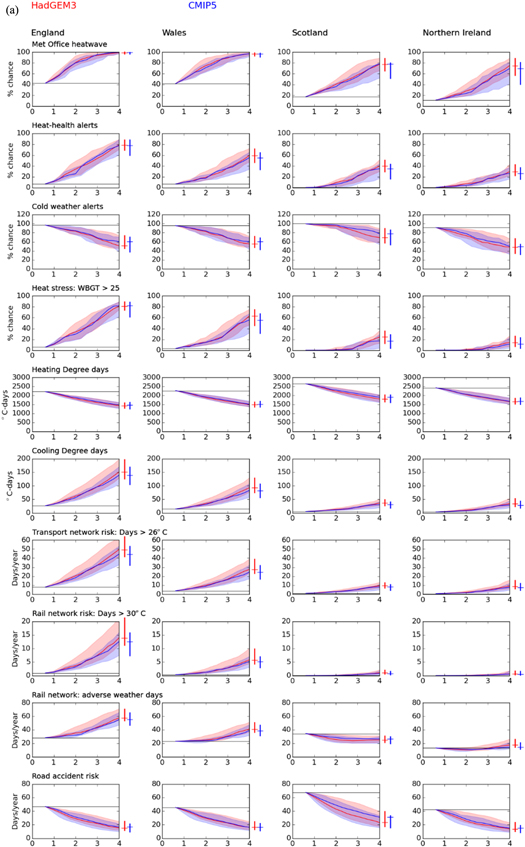
4. Climate risk indicators at different levels of warming
Figure 5 shows the national climate risk indicators against change in global average temperature above pre-industrial levels, and figures 6 and 7 show the indicators for English and Scottish regions respectively. Table 2 summarises the national indicators at 2 and 4 °C increases above pre-industrial levels with the HadGEM3 ensemble. National and regional tables for both ensembles are provided in Supplementary Material. The indicators are mostly plotted as absolute values (some are shown as change from the 1981–2010 value), and the 'current' values (1981–2010) correspond to an increase in temperature of 0.61 °C above pre-industrial levels.
Download figure:
Standard image High-resolution image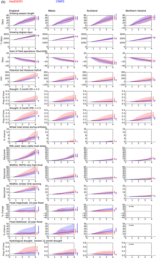
Figure 5 (a).Change in national climate risk indicator with increase in global mean temperature relative to pre-industrial levels: heat and transport indicators. The plots show the median and the range across the HadGEM3 and CMIP5 ensembles separately: the CMIP5 ensemble consists only of the models which reach an increase in global mean temperature of at least 4 °C above pre-industrial levels. The bars to the right of each plot show change at a 4 °C increase. (b) Change in national climate risk indicator with increase in global mean temperature relative to pre-industrial levels: agriculture, wildfire and water indicators. The plots show the median and the range across the HadGEM3 and CMIP5 ensembles separately: the CMIP5 ensemble consists only of the models which reach an increase in global mean temperature of at least 4 °C above pre-industrial levels. The bars to the right of each plot show change at a 4 °C increase.
Download figure:
Standard image High-resolution image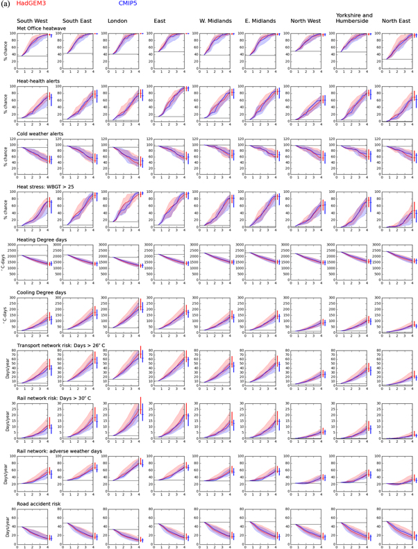
Download figure:
Standard image High-resolution image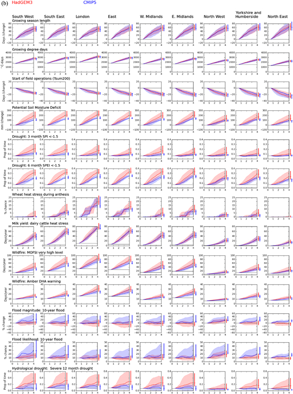
Figure 6 (a).Change in English regional climate risk indicators with increase in global mean temperature relative to pre-industrial levels: heat and transport indicators. (b) Change in English regional climate risk indicators with increase in global mean temperature relative to pre-industrial levels: agriculture, wildfire and water indicators.
Download figure:
Standard image High-resolution image
Figure 7 (a).Change in Scottish regional climate risk indicators with increase in global mean temperature relative to pre-industrial levels: heat and transport indicators. (b). Change in Scottish regional climate risk indicators with increase in global mean temperature relative to pre-industrial levels: agriculture, wildfire and water indicators.
Download figure:
Standard image High-resolution imageTable 2. Climate risk indicators at 2 and 4 °C above pre-industrial levels, by nation, HadGEM3 projections. The tables show the median estimate, plus the range between the lowest and highest in parentheses. The tables also show the 1981–2010 value.
| a) England and Wales | |||||||
|---|---|---|---|---|---|---|---|
| England | Wales | ||||||
| now | 2 °C | 4 °C | now | 2 °C | 4 °C | ||
| Met Office heatwave | % chance of at least one | 42 | 80 (74–93) | 98 (97–100) | 42 | 72 (64–89) | 96 (93–99) |
| Amber heat-health alerts | % chance of at least one | 7 | 33 (22–49) | 77 (70–88) | 7 | 18 (14–30) | 55 (47–72) |
| Cold weather alerts | % chance | 97 | 82 (91–76) | 51 (74–45) | 96 | 83 (92–75) | 55 (72–48) |
| Heat stress: WBGT > 25 | % chance | 6 | 33 (20–50) | 81 (74–89) | 3 | 15 (9–23) | 61 (46–75) |
| Heating Degree Days | °C-days | 2207 | 1817 (1965–1744) | 1435 (1592–1306) | 2263 | 1880 (2027–1810) | 1486 (1643–1368) |
| Cooling Degree Days | °C-days | 26 | 60 (49–87) | 146 (127–197) | 14 | 32 (25–50) | 89 (76–128) |
| Transport: days > 26 °C | Days/year | 8 | 20 (16–29) | 48 (42–64) | 4 | 9 (7–15) | 27 (23–39) |
| Rail network: days >30 °C | Days/year | 1 | 3.6 (2.7–6.6) | 13.7 (11.3–21.3) | 0.3 | 1.2 (0.8–2.5) | 5.7 (4.3–9.9) |
| Rail network: adverse weather days | Days/year | 28 | 35 (33–44) | 56 (54–71) | 23 | 25 (23–31) | 39 (36–51) |
| Road accident risk: days <0 °C | Days/year | 47 | 29 (26–39) | 14 (12–25) | 45 | 29 (26–39) | 15 (13–25) |
| Growing season length | Days | 247 | 276 (264–284) | 306 (290–318) | 245 | 272 (261–281) | 304 (289–317) |
| Growing degree days | °C-days | 1710 | 2182 (2027–2242) | 2745 (2590–2928) | 1555 | 1965 (1821–2040) | 2514 (2357–2701) |
| Start of field operations | Day of year | 51 | 41 (38–46) | 30 (27–38) | 50 | 40 (38–45) | 31 (27–37) |
| Potential Soil Moisture Deficit | mm | 209 | 281 (245–345) | 396 (363–482) | 114 | 159 (132–212) | 250 (197–324) |
| Agricultural drought: 3m SPI<−1.5 | Proportion of time | 0.07 | 0.09 (0.06–0.14) | 0.15 (0.11–0.26) | 0.06 | 0.1 (0.06–0.16) | 0.17 (0.11–0.28) |
| Agricultural drought: 6m SPEI<−1.5 | Proportion of time | 0.07 | 0.15 (0.1–0.25) | 0.31 (0.26–0.39) | 0.07 | 0.13 (0.09–0.23) | 0.27 (0.22–0.36) |
| Days with wheat heat stress | % chance | 0.1 | 1.1 (0.4–4.1) | 7.2 (4.5–13.1) | 0 | 0 (0–0) | 0.1 (0–2.9) |
| Days with reduced milk yield | Days/year | 3.3 | 12.3 (8.4–19.5) | 39.6 (32.6–53.7) | 1.4 | 5.3 (3.3–9.2) | 22.3 (17.4–32.9) |
| Wilfdire: MOFSI very high danger | Days/year | 13 | 22 (19–33) | 43 (33–62) | 5 | 8 (7–12) | 18 (12–28) |
| Wildfire: DHA amber warning | Days/year | 37 | 49 (44–60) | 71 (62–92) | 25 | 30 (28–35) | 42 (36–54) |
| 10-year flood magnitude | % change in magnitude | 0 | −2 (−12–11) | −2 (−12–12) | 0 | 7 (−8–23) | 15 (6–25) |
| Likelihood of current 10-year flood | % chance of exceedance | 10 | 10 (6–16) | 11 (7–18) | 10 | 14 (6–26) | 21 (14–31) |
| Hydrological drought: 12m SSI<−1.5 | Proportion of time | 0.06 | 0.15 (0.1–0.25) | 0.27 (0.18–0.53) | 0.05 | 0.1 (0.05–0.21) | 0.14 (0.06–0.32) |
| b) Scotland and Northern Ireland | |||||||
|---|---|---|---|---|---|---|---|
| Scotland | Northern Ireland | ||||||
| now | 2 °C | 4 °C | now | 2 °C | 4 °C | ||
| Met Office heatwave | % chance of at least one | 17 | 39 (30–49) | 77 (65–88) | 11 | 28 (19–41) | 74 (57–88) |
| Amber heat-health alerts | % chance of at least one | 0 | 8 (2–14) | 39 (29–51) | 0 | 7 (3–12) | 29 (22–43) |
| Cold weather alerts | % chance | 100 | 95 (99–89) | 69 (89–58) | 91 | 73 (88–68) | 47 (67–35) |
| Heat stress: WBGT > 25 | % chance | 0 | 1 (0–5) | 24 (13–35) | 0 | 1 (0–3) | 14 (7–26) |
| Heating Degree Days | °C-days | 2642 | 2232 (2434–2138) | 1797 (2023–1647) | 2419 | 2039 (2235–1988) | 1648 (1841–1525) |
| Cooling Degree Days | °C-days | 5 | 12 (9–17) | 34 (27–49) | 4 | 10 (7–15) | 32 (24–53) |
| Transport: days > 26 °C | Days/year | 1 | 3 (2–4) | 9 (7–13) | 1 | 2 (1–4) | 8 (6–15) |
| Rail network: days >30 °C | Days/year | 0 | 0.1 (0–0.3) | 1 (0.6–2) | 0 | 0 (0–0.2) | 0.6 (0.4–1.7) |
| Rail network: adverse weather days | Days/year | 34 | 25 (22–33) | 25 (22–31) | 13 | 11 (9–14) | 17 (15–26) |
| Road accident risk: days <0 °C | Days/year | 68 | 42 (37–60) | 23 (18–40) | 42 | 25 (23–38) | 13 (10–23) |
| Growing season length | Days | 215 | 244 (230–254) | 280 (260–298) | 237 | 266 (248–275) | 302 (280–315) |
| Growing degree days | °C-days | 1232 | 1580 (1453–1659) | 2066 (1906–2241) | 1405 | 1781 (1620–1843) | 2278 (2112–2473) |
| Start of field operations | Day of year | 65 | 49 (46–61) | 36 (32–50) | 49 | 41 (38–47) | 32 (28–40) |
| Potential Soil Moisture Deficit | mm | 120 | 150 (124–191) | 206 (163–275) | 87 | 112 (88–147) | 167 (121–226) |
| Agricultural drought: 3m SPI<−1.5 | Proportion of time | 0.07 | 0.07 (0.05–0.11) | 0.09 (0.05–0.17) | 0.07 | 0.08 (0.05–0.13) | 0.14 (0.07–0.23) |
| Agricultural drought: 6m SPEI<−1.5 | Proportion of time | 0.06 | 0.1 (0.07–0.16) | 0.18 (0.12–0.27) | 0.07 | 0.11 (0.06–0.19) | 0.22 (0.14–0.34) |
| Days with wheat heat stress | % chance | 0 | 0 (0–0.3) | 0.5 (0–1.5) | 0 | 0 (0–0) | 0 (0–0) |
| Days with reduced milk yield | Days/year | 0.3 | 1.5 (0.8–2.4) | 7.8 (5.3–12.1) | 0.3 | 1.8 (0.8–3.2) | 10.1 (7–18) |
| Wilfdire: MOFSI very high danger | Days/year | 5 | 7 (6–9) | 10 (8–15) | 2 | 2 (2–4) | 6 (4–12) |
| Wildfire: DHA amber warning | Days/year | 24 | 27 (25–29) | 32 (28–38) | 15 | 18 (16–20) | 23 (20–30) |
| 10-year flood magnitude | % change in magnitude | 0 | 0 (−9–15) | 9 (−4–19) | none | none | none |
| Likelihood of current 10-year flood | % chance of exceedance | 10 | 11 (7–20) | 16 (10–23) | none | none | none |
| Hydrological drought: 12 m SSI<−1.5 | Proportion of time | 0.07 | 0.12 (0.03–0.26) | 0.13 (0.09–0.29) | none | none | none |
Risks related to high temperature extremes clearly increase with level of warming: there are more heatwaves, days with heat stress for people, animals and crops, and a greater frequency of disruptive temperature extremes on the transport network. Risks related to low temperature extremes—including the frequency of cold weather alerts and road accident risk—decrease, but are not eliminated. Higher temperatures mean increased cooling degree days and reduced heating degree days, implying changes in building energy demands and a redistribution of system energy demands through the year. Higher temperatures also result in an increase in growing degree days and a longer growing season with an earlier start. This potentially increases the growth of perennial crops (such as grass) and increases the opportunities to grow crops which require warmer temperatures, but may mean that annual crops currently grown mature more quickly with consequent reductions in yield (Arnell and Freeman 2021b).
Wildfire risk increases too, primarily because of the projected increase in temperature and reduction in humidity (Arnell et al 2021b). Changes in drought, flood and soil moisture deficits are more determined by change in rainfall, and these generally change in a more adverse direction—more agricultural and water resources droughts, greater soil moisture deficits, and (particularly in the north and west of the UK), more river flooding. As highlighted in table 2, risks in a 2° world (sometimes described as 'safe' in the media) can be substantially different to risks over the recent past (1981–2010, with an increase of 0.61 °C). For example, the chance of a Met Office heatwave is approximately doubled, in England and Wales the chance of a heat stress day (for people and animals) is increased by a factor of five, cooling degree days more than double, and the number of days with increased danger wildfire increases by between 40 and 70%.
The uncertainty range is relatively small for the temperature-based indicators, but is considerably larger for the indicators which are determined by rainfall—particularly flood and drought. Users could adopt either a central estimate or the upper end of the uncertainty range (a 'worst case') to characterise risks in 2 and 4° worlds, based on their risk appetite. The difference between the central estimate and the 'worst case' is greatest for the flood and drought indicators.
Most of the indicators show a broadly linear or slightly accelerating change with increase in global mean temperature, starting from 1981–2010. The rate of change per degree varies between indicators and regions. Note that a linear relationship does not mean that the change in indicator at 4 °C from current values (for example) would be twice the change at 2 °C, because the current value corresponds to an increase already of 0.61 °C. The change at 4 °C, relative to current conditions, would be 2.44 times the change at 2 °C ((4–0.61)/(2-0.61)).
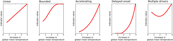
Some of the indicators show more highly non-linear changes with temperature, for four main reasons (figure 8). First, the rate of change sometimes decreases with increase in temperature because the indicator has an upper bound—for example a likelihood of 100%. This can be seen with the heat-health alert indicator in southern and eastern England, where the annual likelihood reaches 80% at around 2 °C before increasing more slowly towards the upper limit of 100%. Second, some indicators show an accelerating trend with global mean temperature change. This arises with indicators based on high thresholds currently rarely exceeded, such as the number of rail network risk days with maximum temperatures greater than 30 °C. The third cause of non-linearity is a variation of this with even higher thresholds, where the threshold is currently never exceeded and only begins to be crossed once a particular increase in temperature is reached. This can be seen with the wheat heat stress indicator in southern and eastern England, and the WBGT heat stress indicator. Fourth, non-linearity can arise as a result of the interaction of separate linear trends in different drivers of an indicator. This can be seen with the railway adverse weather days indicator in northern England and Scotland, where an initial reduction caused by fewer low temperature and snow events is increasingly offset by greater disruption from high temperatures. The shape of the relationship between level of warming and indicator therefore may depend on the precise definition of the indicator.
Figure 8. Different shapes of the relationship between level of warming and risk.
Download figure:
Standard image High-resolution image
There is regional variability in the response to increases in global mean temperature for most of the indicators. For the temperature threshold indicators, this is largely due to regional variation in the current chance of the thresholds being exceeded (Arnell et al 2021a): the spatial variation in change in local temperature is small compared with variation in current temperature. This means that indicators based on high temperature extremes increase more rapidly, and are at a higher absolute level, in the warmer southern parts of the UK. For the precipitation-dominated indicators (flood and drought), the variability between regions is largely due to variations in the change in climate, partly because these indicators are based on site-specific thresholds (the current chance of the 10-year flood is by definition constant everywhere), but largely because there is much stronger regional variability in change in rainfall than in temperature. There is little regional variability in the change in growing season length, and whilst the absolute changes in heating and growing degree days vary across the UK there is much less variation in the percentage changes.
For most of the indicators there is little difference in the rate of change between the HadGEM3 and CMIP5 ensembles. This is in contrast to the large differences between them when indicators are presented over time (Arnell et al 2021a), which is largely due to the differences in increase in global mean temperature between the two ensembles. The HadGEM3 ensemble tends to give slightly higher changes per degree for indicators based on extreme summer temperatures. There is more difference between the two ensembles with the precipitation-based indicators—particularly flood, drought and potential soil moisture deficit - because the HadGEM3 ensemble typically produces smaller increases in rainfall in winter and greater decreases in summer than the CMIP5 ensemble. The difference between the two ensembles for the wildfire indicators arises because the HadGEM3 ensemble projects a greater reduction in relative humidity (Arnell et al 2021b).
5. Implications and conclusions
This paper has presented relationships between indicators of climate risk in the UK and global mean temperature, allowing the estimation of change in risk—and implicitly therefore the demand for increased adaptation - at different levels of warming. It provides summary information representing risks (central estimates and 'worst cases') in worlds with 2 and 4 °C warming relative to pre-industrial levels.
There are a number of caveats with this analysis. The time sampling approach used to identify periods with a given increase in global mean temperature does not take into account the effect of the details of the climate forcing or the rate of change in forcing on the relationship between local climate change and increase in global average temperature. These effects are likely to be small compared to variability across climate model projections, for the indicators considered here. It is assumed that each individual ensemble member is equally plausible. The transient delta method applied here preserves historical day to day and year to year variability in weather and does not take into account potential changes in the distribution of climate variables. The climate change effects may therefore be underestimated. The analysis does not attempt to characterise the significance or importance of changes in risk through categorisation into 'levels of concern': such thresholds vary with context and need to be defined by users. Expressing indicators as a function of level of warming rather than time is appropriate for indicators that respond rapidly to increasing temperatures, but not for indicators which are strongly influenced by the rate of change (for example indicators relating to sea level rise or impacts on ecosystems). Changes in exposure and vulnerability over time will also alter the relationship between change in temperature and climate risk, as of course would changes to the critical thresholds currently used to define the indicators.
Nevertheless, the paper provides information to support risk assessment and to characterise what 2 and 4 °C worlds would look like in the UK. Both worlds would see changes in climate risk indicators compared to the present, with more frequent heat extremes (affecting people, plants and animals) and droughts, a greater fire danger, increased cooling degree days, and increased growing season length and growing degree days and reduced heating degree days. The chance of river flooding would be higher in the north and west of the UK in particular, but there is a large uncertainty in change in flood risk. The chance of cold weather extremes is reduced but not eliminated. Risks increase above current levels in a 2 °C world, frequently assumed (at least in the media) to be 'safe'. Many indicators change approximately linearly with increase in global mean temperature. Given that current temperature is around 0.61 °C higher than pre-industrial levels, the change in indicator in a 4 °C world would be around 2.4 times greater than the change in a 2 °C world. However, some indicators show a more highly non-linear relationship with global mean temperature. The increase in risk may accelerate as temperature increases, particularly where the threshold defining the indicator is currently rare. Where the indicator is a combination of several drivers (e.g. temperature and rainfall), then differences in the rate of change of each can lead to non-linear change with level of warming. Where the indicator is expressed as the chance of experiencing an event—and that chance becomes inevitable with warming—then further warming may appear to lead to no further increase in risk even though the duration or intensity of the event will continue to increase. The precise definition of an indicator of climate risk may therefore affect the impression of change with level of warming. Non-linearity also implies that it can be difficult to infer changes at one level of warming from estimates of change at another.
Expressing indicators as a function of temperature rather than time reduces the effect on the estimated range of impacts of uncertainty in the rate of change in climate over time, which arises due to both uncertainty in global climate response to forcing and more radical uncertainty in the future rate of forcing. Specifically in this instance, it reduces the differences between the HadGEM3 and CMIP5 UKCP18 global strand projections. The range in change in indicator at a given level of warming is primarily caused by uncertainty in the regional response of rainfall and, to a lesser extent, other relevant climate variables, to increasing forcing.
The information presented in this paper is directly relevant to national, regional and local organisations seeking evidence on risks at different levels of warming to inform high-level mitigation and adaptation strategy and policy. Expressing strategies and targets in terms of level of warming (for example 'aim for 2 and plan for 4') is more general than focusing on specific emissions scenarios and links adaptation policy closer to climate mitigation policy. Sector-specific adaptation strategies and plans, however, may require additional information on when specific levels of warming might be reached in order to schedule interventions. This would involve combining the relationships presented in this paper with projected increases in temperature under plausible and 'worst case' emissions scenarios. Alternatively, it is possible to construct trajectories of change in risk associated with pathways reaching specific levels of warming by a certain time. For example, Arnell et al (2021a) constructed pathways and risk indicators through the 21st century consistent with warming in 2100 of 2, 3 or 4 °C by sampling from UKCP18 probabilistic projections.
The analysis here demonstrates the sensitivity of climate risks in the UK to level of warming, and highlights the considerable regional variability in impact for some indicators. Further analysis could concentrate on two areas: assessment of other indicators for dimensions of climate change not considered here (for example extreme rainfall and storms), and the construction of relationships between level of warming and risk for indicators sensitive to the evolution of change in climate over time (for example ecosystem or coastal indicators).
Acknowledgments
This research was funded through the UKRI Climate Resilience programme (Grant NE/S016481/1).
Data availability statement
All data that support the findings of this study are included within the article (and any supplementary files).