Climate change and its impacts
Published December 2017
•
Copyright © IOP Publishing Ltd 2017
Pages 1-1 to 1-27
You need an eReader or compatible software to experience the benefits of the ePub3 file format.
Download complete PDF book, the ePub book or the Kindle book

Permissions
Abstract
In this chapter we examine the origins of the natural greenhouse effect and the role different atmospheric gases play in creating the Earth's climate. We then consider how anthropogenic emissions are altering the status quo and how scientist try to predict how the weather and climate of the future may be altered.
Climate is a difficult concept for people to deal with, as generally we think in terms of short-term variations or weather, and our memory is drawn towards more extreme events such as heat waves, cold snaps, and storms. Climate, however, is defined as the long-term averages and ranges of different weather variables. Changes in climate typically take many thousands of years; hence, human civilisation has evolved during a period of relatively constant climate. This means that buildings, urban areas, and even human physiology are ill-adapted to relatively rapid changes in climate over several decades or centuries.
The world is experiencing a massive transition from rural to urban living. Urban areas occupy less than 2% of the Earth's land surface, but house over 50% of the world's population, a figure that was only 14% in 1900 and one which is estimated to increase to 60% by 2030. This rapid rise will mainly take place in developing countries. Asia and Africa will see the largest increases in urban population, which are expected to reach 64% and 56% urban population, respectively, by 2050. Countries such as Mali, Niger, Tanzania, Uganda, and Zambia are predicted to see greater than a five-fold increase in urban population by 2050. If the developing world continues to urbanise as expected, replacing sprawling urban areas with extremely dense ones, they will face a plethora of problems. Denser urban areas are generally considered to be more sustainable, requiring less land, infrastructure, and being resource efficient; and it is highly probable that future cites in currently developing countries will be at least as dense as those in the developed world. However, this comes at the cost of poorer air quality, reduced biodiversity, reduced flood resilience, higher air temperatures due to the urban heat island, and potentially poorer physical and mental health associated with reduced green (grass, trees, and vegetation) and blue space (reservoirs, lakes, rivers, canals etc).
Climate change will affect the performance of buildings, urban areas, and the comfort and health of a city's occupants. This chapter will cover the origins and scientific basis for climate change before presenting an overview of the impacts of climate change based upon the latest climate projections. Using these projections, the following chapters will examine the potential impacts of climate change on urban areas, and consider how to increase the resilience of our growing urban areas to a rapidly changing climate.
1.1. The greenhouse effect
The climate Earth experiences is a function of its distance from the Sun and the amount of radiation (energy) received. At any given time, the surface of the Earth must be in equilibrium with its surroundings; therefore, the Earth must be re-radiating an equal amount of energy to that received from the Sun. All objects at a temperature above absolute zero (0 K, −273 °C) emit radiation. The hotter the object, the shorter the mean wavelength (λ) of this radiation. The peak wavelength of the distribution (black-body curve) of radiation emitted, λmax (in metres, m), is given by Wien's displacement law:
where T (in Kelvin, K) is the temperature of the object. For the Sun, with a surface temperature of ∼5800 K, the peak is at ∼500 nm (500 × 10−9 m), which is in the visible light region. For the Earth, with its much lower temperature, the radiation is of a longer wavelength and within the infrared part of the electromagnetic spectrum.
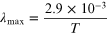
The Sun is not a perfect black-body emitter, and not all the wavelengths of radiation given off reach the Earth's surface. Ozone (O3) in the atmosphere absorbs and re-radiates ultra-violet (UV) light. Rayleigh scattering by dust particles in the upper atmosphere scatters blue light, which is why we view the sky as blue. Other wavelengths of light primarily in the near-infrared region are absorbed and re-radiated by other gases in the atmosphere such as oxygen (O2) and water vapour (H2O). These absorption windows are associated with different mechanisms of bending and stretching molecular bonds. The solar spectrum both at the top of the atmosphere and what reaches the surface of the Earth can be seen in figure 1.1.
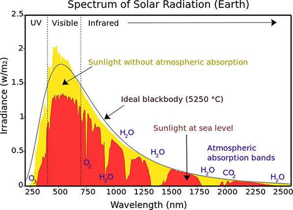
Figure 1.1. Solar spectrum at the top of the atmosphere and at sea level (This solar spectrum image has been obtained by the author from the Wikimedia website where it was made available under a CC BY-SA 3.0 licence. It is included within this article on that basis. It is attributed to Nick84.
Download figure:
Standard image High-resolution imageSince we know the temperature of the Sun from its colour and spectral output and we also know the distance of the Earth from the Sun, we can calculate how much radiation the Earth receives, and hence the temperature the Earth should be to be in equilibrium, i.e. radiating an equivalent amount of energy to that it receives.
A hot object will radiate with an intensity I (W m−2, Watts per square metre) given by

where σ is the Stefan–Boltzmann constant (5.67 × 10⁻⁸ W m−2 K−4). The surface of the Sun is at around ∼5777 K, and hence radiates 6.32 × 10⁷ W m−2. The solar radius is 6.96 × 10⁸ m (696 000 km), and the surface area (4πr2) of the Sun is 6.1 × 10¹⁸ m2; therefore, the Sun must radiate with a luminosity of 3.85 × 1026 W. Assuming this radiation is emitted equally in all directions, we can estimate how much of this is intercepted by the Earth. If we imagine this radiation smeared across the inside of a sphere centred on the Sun and intersecting the Earth, as shown in figure 1.2, we can work out the fraction of the energy intercepted by the Earth from the ratio of the two surface areas, i.e. of the sphere and the Earth.
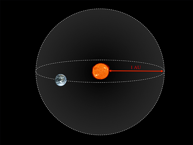
Figure 1.2. Consider a sphere of radius 1 AU centred on the Sun, with the Earth intersecting the surface.
Download figure:
Standard image High-resolution imageThe Earth is at a distance of one Astronomical Unit (1 AU) from the Sun, which is equivalent to 1.496 × 10¹¹ m (149.6 million km). Therefore, the surface area of the sphere intersecting the Earth is 2.81 × 10²³ m2. The Earth will project an area of πr2 onto the surface of this sphere, which with a radius of 6.371 × 10⁶ m (6371 km) equals 1.275 × 10¹⁴ m2. Taking the ratio between the surface area of the sphere and the area the Earth projects on the surface of this sphere, we can calculate that the Earth receives only 1/4.5 × 1010th of the radiation from the Sun. Or in simpler terms, the Earth receives 1.74 × 10¹⁷ W from the Sun.
Not all the radiation received by the planet is absorbed. The Earth has an albedo of ∼0.3, meaning ∼30% is reflected back directly into space from the atmosphere and the ground. This albedo varies slightly according to the amount of cloud cover in the atmosphere and where it is situated. Thus, the planet absorbs approximately 1.22 × 10¹⁷ W, which when averaged over the whole surface of the Earth (4πr2), is approximately ∼239 W m−2. The planet must be in radiative balance (equilibrium), re-radiating all radiation received; else the planet's temperature would continuously increase. Hence, working backwards using I = σT4, we can estimate the temperature of the Earth required to be in radiative balance. This suggests that the temperature of the Earth should be ∼255 K, or −18 °C. While this value calculated is close to the measured temperature of the Moon, clearly, this is not true for the Earth. The average temperature of the Earth is closer to 15 °C (298 K). The reason for this, which all scientists agree on, lies in the makeup and chemistry of the Earth's atmosphere.
This atmospheric chemistry, which is responsible for the ∼33 °C disparity between the observed and calculated temperature of the Earth's surface, is termed the natural greenhouse effect. The basis of this effect lies in the relative absorption spectra of the different atmospheric gases. Figure 1.3 shows the Earth in the visible spectrum; the result is the iconic blue marble that we are all familiar with, indicating that the entire visible spectrum is able to pass unhindered through the atmosphere to the surface. Light from the Sun travels through space, through the atmosphere, hits the surface of the Earth (in the case of figure 1.3, a grain of sand in the Sahara), and is reflected back through the atmosphere of the Earth to the camera lens, unobstructed and without scattering. The fact that we can see the surface of the Earth from space in great detail tells us that we have not lost any directional information, and that light is not scattered, diverted, or absorbed during its passage through the atmosphere. The only scattering comes from clouds in the atmosphere; because they appear white, we can deduce that they scatter all visible light equally. The result is that of the solar radiation intercepting the Earth, around 70% is absorbed, contributing to heating the surface, while ∼30% is reflected from the surface or from clouds in the atmosphere. The atmosphere itself is transparent. For comparison, figure 1.4 shows the Earth viewed at two wavelengths in the infrared spectrum. The left-hand image shows the Earth viewed at 6.7 μm (6.7 microns or 6.7 × 10⁻⁶ m), which is within a water vapour absorption band. We can see that we have lost all directional information, and light is being fully scattered (absorbed and re-radiated) within the atmosphere. The right-hand image shows the same image of the Earth but viewed at 12 μm, which while in the infrared spectrum is largely transmitted by the atmospheric greenhouse gases. Here we can see we have lost some directional information: the image is milky not crystal clear, but we can still make out the continents. This is the origin of the natural greenhouse effect and the additional warming the Earth receives as a result. Visible light is able to pass relatively unhindered through the atmosphere to the surface of the planet, thus warming the surface. The warm surface of the planet radiates according to its temperature in the infrared spectrum. However, these wavelengths of light find it much harder to pass through the atmosphere, and are reflected back to the surface, or are absorbed and re-radiated by gases in the atmosphere. The absorption (and transmission) spectra of the atmosphere as a whole and the most important greenhouse gases are shown in figure 1.5.
Figure 1.3. The Earth viewed from space in the visible light spectrum (courtesy of NASA).
Download figure:
Standard image High-resolution image
Figure 1.4. The Earth viewed from space in the infrared spectrum (courtesy of NASA).
Download figure:
Standard image High-resolution image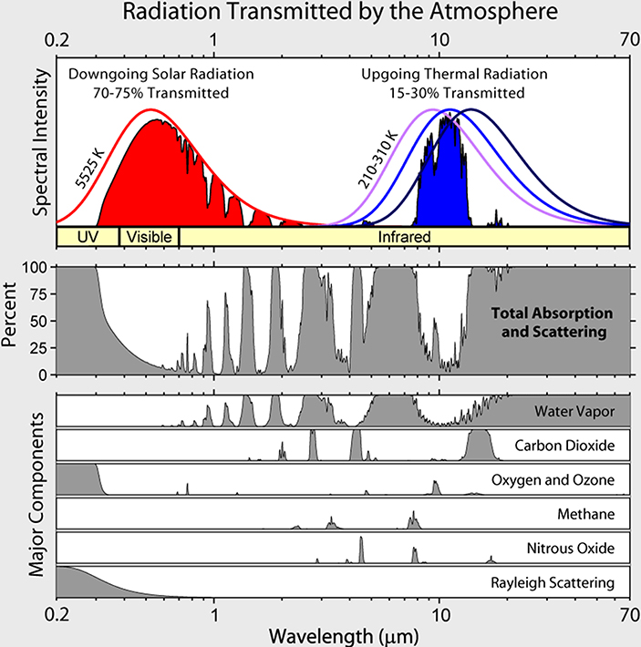
Figure 1.5. Plot of the radiation transmitted through the atmosphere (top) and the relative absorption spectra of the various atmospheric greenhouse gases (bottom). This transmission spectrum image has been obtained by the author from the Wikimedia website where it was made available under a CC BY-SA 3.0 licence. It is included within this article on that basis. It is attributed to Global Warming Art.
Download figure:
Standard image High-resolution imageThe absorption spectrum arises from the absorption of light and its conversion into mechanical energy; in this case, vibrations of molecular bonds and the motion of constituent atoms. This energy is transferred to the surrounding gases (principally nitrogen and oxygen, which are not greenhouse gases), thus leading to a warming of the atmosphere.
Although we have to have a radiative balance at the top of the atmosphere for the planet to be in equilibrium, for the surface and the rest of the atmosphere we need a more complex approach. We need to take account of the absorption, reflection, heat transfer, and convection within the atmosphere. As we can see from figure 1.5, different atmospheric gases absorb different wavelengths of light, and these gases must re-radiate all the energy they absorb; however, unlike the surface of the Earth, they are able to radiate in all directions, not just upwards. Hence, some of this radiation will be re-radiated back towards the Earth's surface and contribute to additional heating. This is this natural greenhouse effect that produces the elevated surface temperatures and results in the average temperature of the Earth being 15 °C rather than −18 °C. We can see from figure 1.5 that water vapour is the largest contributor to atmospheric absorption. Additionally, water vapour is responsible for approximately 22 °C of the 33 °C additional warming experienced as a result of the natural greenhouse effect.
Figure 1.6 provides an illustration of the typical magnitudes of the radiative flux experienced through the atmosphere. Of the 341 W m−2 that hits the top of the atmosphere, around 30% is reflected back out to space (net downwards radiation absorbed 239 W m−2). This value must be equivalent to the total outgoing radiation for the Earth to be in equilibrium. The atmosphere absorbs 79 W m−2, while 160 W m−2 is absorbed by the surface. Around 80 W m−2 goes into the evaporation of water and transpiration of water by plants (collectively referred to as evapotranspiration) and drives the hydrological cycle, while around 17 W m−2 is used to set up convection currents within the atmosphere. Ultimately, the total up-going radiation from the Earth's surface is 396 W m−2, of which 333 W m−2 is reflected or radiated back towards the surface by the atmosphere. It is this that produces the higher than expected average surface temperatures. There is only a small window of wavelengths where heat (infrared radiation) can pass through the atmosphere unimpeded, accounting for only 40 W m−2. The remainder of this radiation warms the atmosphere, as do the sensible and latent heat contributions.
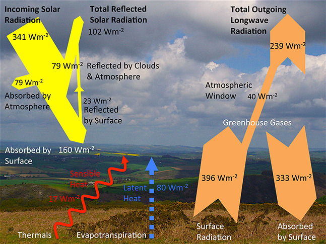
Figure 1.6. Representation of the average radiation balance of the atmosphere. These values will vary according to season, latitude, and with astronomical mechanics.
Download figure:
Standard image High-resolution image1.2. The historic climate signal
While human civilisation has arisen during a period of relatively constant climate, the Earth has seen many different climates over its 4.5 billion year history. Through examination of the fossil record and deep ice cores, we can draw a picture of what life on Earth was like at different time periods.
There are stable isotopes of oxygen, oxygen-16 (16O), which contains 8 protons and 8 neutrons, and the less common oxygen-18 (18O), containing 8 protons and 10 neutrons. In the paleosciences the ratio of 18O : 16O (δ18O) found in corals, fossils, and ice cores can be used as a proxy for temperature. This arises from the differential rates at which water molecules containing these isotopes evaporate or condense. When water vapour condenses, the heavier water molecules containing 18O atoms condense and precipitate first. Thus, there is a preferential evaporation of 16O from seawater, and hence fresh water precipitation is 16O-enriched, leading to a gradient in the δ18O with latitude. Ocean surfaces contain greater amounts of 18O around the tropics where there is increased evaporation and reduced amounts of 18O at the mid-latitudes where there is more rain. Additionally, the amount of 18O present in water vapour is greater at the tropics than closer to the poles, due to higher temperatures and greater evaporation. Snow that falls in Russia or Canada has much less H2 18O than rain that falls in Malaysia or Peru. Similarly, snow falling at the centre of an ice sheet will have less 18O than snow falling at the edges of the ice sheet, which is due to the preferential condensation of 18O and H2 18O precipitating first. From the δ18O ratio we can infer the temperature of precipitation, and hence how much warmer or colder the Earth was at the time the snow fell.
Additionally, study of Antarctic ice cores examining the ratio of oxygen to nitrogen in bubbles within the ice can be used to infer the level of insolation (solar radiation intensity). These bubbles within the ice can also be analysed to determine the concentrations of greenhouse gases at the time, such as carbon dioxide (CO2) and methane (CH4). Resultant changes in climate from differing greenhouse gas concentrations alter the patterns of global evaporation and precipitation, and therefore change the δ18O ratio. Data from Vostok Station in Antarctica (shown in figure 1.7) shows that the Earth's climate has varied considerably over previous millennia, with peaks and troughs in temperature.
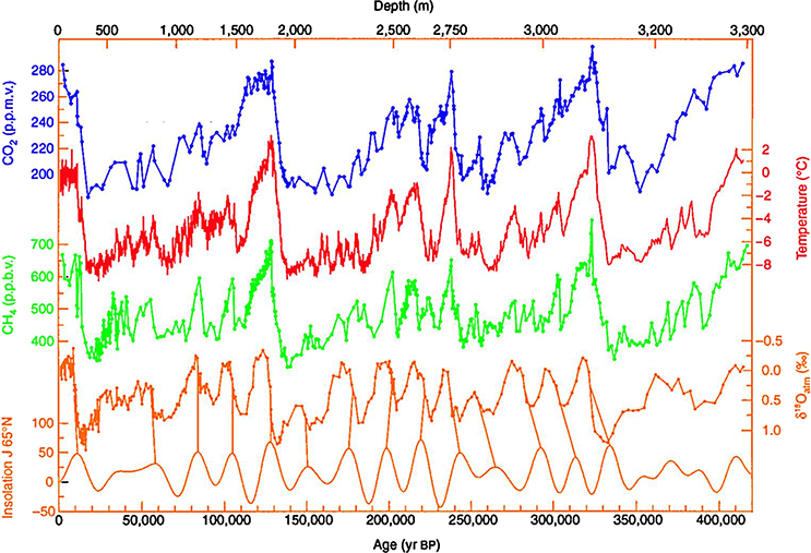
Figure 1.7. Ice core data from Vostok Station in Antarctica, showing δ18O and associated temperature estimation. Also shown are insolation, CH4 (parts per billion by volume), and CO2 (parts per million by volume) concentration from gas bubbles within the ice cores. (This Vostok ice core data image has been obtained by the author (s) from the Wikimedia website [https://commons.wikimedia.org/wiki/File:Vostok_420ky_4curves_insolation.jpg], where it is stated to have been released into the public domain. It is included within this article on that basis.)
Download figure:
Standard image High-resolution imageImportantly, we can see the temperature profile closely follows the concentrations of CO2 and CH4. Furthermore, the temperature profile follows some periodicity related to the level of insolation. Greater insolation means greater evaporation of water, and hence more water vapour in the atmosphere, which is the most important greenhouse gas. But why does the level of insolation vary with time, and why is there periodicity?
Unlike early pictures of the solar system, the planets do not hold circular orbits around the Sun. The Earth spins on its axis and orbits the Sun; however, there are several quasi-periodic interactions due to the gravitational forces from other celestial bodies. The Serbian mathematician Milutin Milanković (1879–1958) studied the changes in the Earth's orbital eccentricity, obliquity, and precession, and their influence of the level of insolation. These observed cycles in insolation, and hence cycles in the Earth's temperature, are now generally referred to as Milankovitch Cycles.
Unlike our idealised example earlier in this chapter, the Earth's orbit is not circular, and the distance from the Sun to the Earth is not a constant. The Earth's orbit is an ellipse. Eccentricity is a measure of the departure of an ellipse from being circular (see figure 1.8); the eccentricity of a circle is by definition 0, while a parabola has an eccentricity of 1 and an ellipse has an eccentricity <1. The equation for a circle is of the form


Figure 1.8. Illustration of a circular orbit (left), and an elliptical orbit with highly exaggerated eccentricity (right).
Download figure:
Standard image High-resolution imagewhile an ellipse has the form

and has an eccentricity (e) of the form

The shape of the Earth's orbit varies with time between nearly circular, with a low eccentricity (e = 0.000 055), and a more elliptical orbit (e = 0.0679). The mean eccentricity of the Earth's orbit is considered to be e = 0.0019. Figure 1.8 provides an illustration of both a circular and a highly eccentric elliptical orbit.
If the Earth was the only planet orbiting the Sun, then the eccentricity of the orbit would not perceptibly alter over millions of years. However, the presence of other large planets in our solar system such as Saturn and Jupiter produces cyclic interactions due their gravitational field, which vary with their orbit around the Sun and the Earth's position relative to them. As you might expect with seven other planets and dwarf planets (including: Pluto, Ceres, and Eris), predicting variations in eccentricity due to so many gravitational interactions is complex. However, the signal is dominated by the largest bodies, resulting in a few main components for the periodicity of the eccentricity. The main component has a period of 413 000 years (e ± 0.012). While other components have periods of 95 000 years and 125 000 years, resulting in a beat frequency of ∼400 000 years. The combinations of these signals loosely combine into a 96 000-year cycle (see figure 1.12) with a magnitude between −0.03 to +0.02. Presently the Earth's orbit has an eccentricity of e = 0.017 and is decreasing.
As eccentricity increases, variations in seasons increase due to varying distance from the Sun and varying insolation. However, this variation in insolation due to eccentricity is generally small, the intensity of the seasons is not primarily governed by the distance from the Sun, but rather the axial tilt of the Earth. The relative increase in insolation at the perihelion (the closest approach to the Sun) compared to insolation at the aphelion (furthest distance from the Sun) is roughly 4× the eccentricity. Currently this amounts to a variation in insolation of ∼6.8%. Perihelion currently occurs around the third of January, while aphelion is around the fourth of July.
Changes to the Earth's eccentricity do not change the length of a year or alter Earth's motion along its orbit. However, higher eccentricity does exaggerate behaviour due to precession and axial tilt, which are explained below.
As we all know, the Earth's axis of rotation is not upright (perpendicular to the direction of orbital motion); instead, the Earth spins around an axis ∼23° off perpendicular (figure 1.9). It is this axial tilt (obliquity) that is responsible for the seasons we experience and the long polar nights and days. The angle of the Earth's axial tilt varies over time with respect to the planet's orbital plane. Axial tilt varies by up to 2.4° between 22.1° and 24.5° in a periodic way, taking approximately 41 000 years. When the obliquity increases, the magnitude of the seasonal variations in insolation increase. Summers receive more radiative flux and winters comparatively less. The opposite is true as obliquity decreases. It should be noted that these changes to the magnitude of insolation are not equal over the entire Earth's surface. At higher latitudes, the mean annual insolation increases with obliquity, while at lower latitudes obliquity decreases insolation. As such, it can be argued that lower obliquity favours the onset of ice ages by reducing both the overall mean summer insolation and additionally reducing insolation at higher latitudes. This results in reduced melting of the previous winter's precipitation, as most of the Earth's snow and ice lies at higher latitudes. The resulting change in the Earth's albedo can result in further cooling, creating an ice age, which will persist until the obliquity increases.
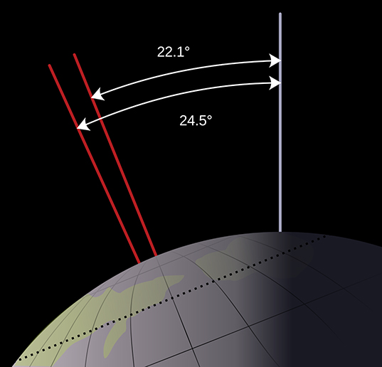
Figure 1.9. Illustration of changes to the Earth's axial tilt or obliquity (orbital motion is out of the page) (courtesy of NASA).
Download figure:
Standard image High-resolution imageCurrently, the obliquity of the Earth is 23.44°, about halfway through its cycle, and is decreasing. The obliquity will reach its minimum around 11 800 AD, and was last at its maximum in 8700 BC. Therefore, we can say that the Earth is currently experiencing a cooling trend.
The Earth not only spins about a tilted axis, which varies with time but also 'wobbles' like a spinning top. This process termed precession is the trend in the direction of the Earth's axis of rotation to rotate relative to the orbital plane and the fixed stars (see figure 1.10). This axial precession has a period of roughly 26 000 years, and is due to gravitational tidal forces exerted by the Sun and the Moon upon the Earth. The contribution from each is roughly equal.
Figure 1.10. Illustration of the Earth's axial precession (courtesy of NASA).
Download figure:
Video Standard image High-resolution imageWhen the Earth's axis of rotation points towards the Sun at perihelion (i.e. the North Pole is pointed toward the Sun), the Northern Hemisphere has a greater variation in seasons while the Southern Hemisphere experiences reduced seasonal variability (milder seasons). Meanwhile, the inverse is true when the axis of rotation points away from the Sun at perihelion (i.e. South Pole points towards the Sun), resulting in greater seasonal variations in the Southern Hemisphere and milder seasons in the Northern Hemisphere. The hemisphere that is at perihelion in summer will receive most of the increase in insolation, resulting in higher summertime temperatures; however, this hemisphere will experience much colder winters when it is in aphelion. this present, the Southern Hemisphere is in perihelion during the summer and aphelion during the winter, and thus experiences a greater variation in seasonal extremes relative to the Northern Hemisphere, which experiences milder seasons.
In addition to eccentricity, obliquity, and axial precession, the Earth's elliptical orbit precesses in space (see figure 1.11). This orbital (apsidal) precession completes a cycle every 112 000 years relative to the fixed stars. Apsidal precession occurs in the elliptic plane, and alters the Earth's orbit relative to the elliptic. In combination with changes in eccentricity, this alters the length of seasons.
Figure 1.11. Illustration of apsidal precession for an exaggerated highly eccentric elliptical orbit. Animation available from https://doi.org/10.1088/978-0-7503-1197-7.
Download figure:
Video Standard image High-resolution image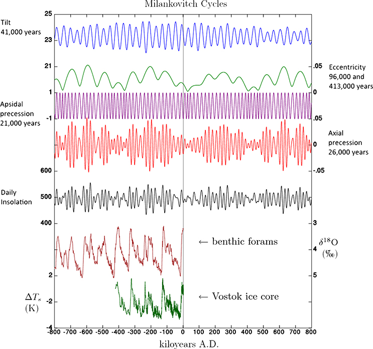
Figure 1.12. Plot of the various components of Milankovitch cycles and the observed δ18O and temperature from ice cores and the fossil record. This Milankovitch Cycles image has been obtained by the author from the Wikimedia website where it was made available under a CC BY-SA 3.0 licence. It is included within this article on that basis. It is attributed to Incredio.
Download figure:
Standard image High-resolution imageAll of these changes in the movement of the Earth relative to the Sun alter the amount of insolation the Earth receives. The sum of all these different cycles in insolation produces a complex signal of temperature oscillation, which can be observed in both the fossil record and in ice cores. Figure 1.12 shows the cyclic contributions of the different orbital movements (Milankovitch cycles), the resultant changes in insolation and the observed variation in δ18O from ice cores and within benthic foraminifera and the inferred variation in temperature. Benthic Foraminifera (forams for short) are single-celled organisms related to amoeba, and produce a hard shell. Foram shells are made of calcium carbonate (CaCO3) and are found in many common geological environments. The δ18O ratio in the shell is used to determine the temperature of the surrounding water at the time the organism was alive. This can be used as another indicator along with ice core δ18O and gas bubbles within the ice to determine what conditions were like on Earth in the past.
1.3. The anthropogenic greenhouse effect
As we have explored in the previous section, the makeup of the Earth's atmosphere is responsible for the climatic conditions we experience and for life as we know it. Given the vast volume of the atmosphere it seems unlikely that human activities could influence the composition of the atmosphere and alter the energetic balance of the planet. The natural greenhouse effect was first described in 1859 by the British scientist John Tyndall, when he discovered that the most common components of the atmosphere—nitrogen and oxygen—were transparent to both visible and infrared radiation. Whereas gases such as carbon dioxide, methane, and water vapour were not transparent in the infrared. He concluded that such gases must have a great influence on our climate. In 1894 the Swedish chemist Svante Arrhenius showed that anthropogenic (man-made) emissions had the potential to alter the climate by further reducing the transparency of the atmosphere in the infrared spectrum. He further concluded that at the current rate of emissions that it would take mankind 3000 years of burning coal to double the concentration of CO2 in the atmosphere; in this last point he was off by around 28 centuries!
While we can examine past climate through ice cores and forams, the resolution both temporally and spatially is quite low. Only relatively recently have we started to monitor the climate of the Earth in greater detail. The oldest running continuous series of temperature observations in the world is the Central England Temperature Record. Daily and monthly temperatures from three observations stations are used to produce representative measurements of a triangular area enclosing Lancashire, London, and Bristol. Monthly measurements begin in 1659, and daily measurements begin in 1772. Figure 1.13 shows a plot of the mean annual temperature from 1659 to the end of 2015, created by averaging the monthly means.

Figure 1.13. Plot of mean annual temperature from the Central England Temperature record.
Download figure:
Standard image High-resolution imageWhile there is a large amount of variability in the temperature record, we can see that there are cooler and warmer periods. For example, we can make out the 'mini ice-age' of the later 17th century, as well as particularly cold or warm individual years. However, since the industrial revolution we can see a steady rise in the temperature signal, despite the Earth being within a cooling cycle determined by orbital mechanics discussed in the previous section. This can be attributed to the changing concentrations of greenhouse gases within the atmosphere as a result of human activities, enhancing the already present natural greenhouse effect. Figure 1.14 shows the trend in atmospheric CO2 since 1958, the so-called Keeling curve, based on the work started by Charles Keeling. Monthly measurements of atmospheric CO2 concentration at the Mauna Loa observatory (Hawaii) by the National Oceanic and Atmospheric Administration (NOAA) show an accelerating trend in CO2 concentration. Recently, atmospheric concentration passed 400 ppm (parts per million) for the first time since modern humans have walked the Earth (compare figure 1.14 to the concentrations shown in figure 1.7 from ice cores).
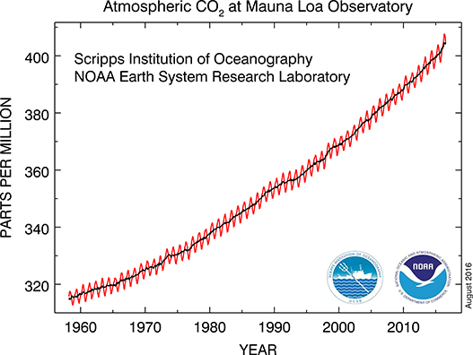
Figure 1.14. Plot of monthly measurements of CO2 from Mauna Loa observatory, the red line represents monthly measurements while the black line is an annual mean (courtesy of NOAA).
Download figure:
Standard image High-resolution imageThe oscillations in the atmospheric CO2 (red line) are a result of the seasonal variations in the northern hemisphere. Since the majority of the Earth's land mass and forests are located in the Northern Hemisphere, the atmospheric CO2 concentration is dominated by the northern summer and winter, due to the annual cycles of plant life. Worryingly, this trend in CO2 concentration does not show any visible deviations due to the Rio Earth summit (1992), the Kyoto protocol (1997), or Rio +20 (2012); the only step in the data is attributed to the collapse of the Soviet Union in the early 90s.
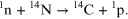
There is often much confusion about the origin of this additional CO2: whether it comes from volcanoes, deforestation, or from the burning of fossil fuels. There is evidence however, to show that the carbon emissions increasing the CO2 concentration of the atmosphere are a result of anthropogenic emissions, primarily from the burning of fossil fuel. Like oxygen, carbon exhibits several different isotopes, with different masses. Carbon in the atmosphere is ∼99.89% carbon-12 (12C) and ∼1.11% carbon-13 (13C), and trace amounts of carbon-14 (14C). 12C and 13C are stable, but 14C is radioactive with a half-life of 5730 years (a half-life is the amount of time it takes for the radioactivity of a substance to halve as it decays). The length of this half-life means that any 14C that was created when the Earth formed would long since have disappeared, implying that new 14C must be constantly being made. This process occurs through highly energetic particles, called cosmic rays, entering the atmosphere, resulting in the production of free neutrons. These neutrons collide with nitrogen atoms in the atmosphere, producing 14C and a proton.
This process occurs in the troposphere and stratosphere at an altitude of 9–15 km. The 14C combines with oxygen molecules to from radioactive 14CO2 at a concentration of one part in a trillion (1:1012), which is taken up by plants and algae, passing up the food chain to other living organisms. While the organism is living, this concentration is maintained, only reducing once the organism dies. This means that the amount of 14C present can be used to date objects such as wooden axe handles or animal hides used for shelter by early humans, or any carbonaceous material up to about 60 000 years old. By carbon dating the atmosphere, we can determine the source of the additional CO2. If the increasing CO2 concentration were the result of deforestation, then the amount of 14C would remain constant, whereas we observe a decreasing concentration of 14C in the atmosphere. This shows that the carbon emissions are coming from an old source of carbon, such as the burning of fossil fuels, which are old enough that all 14C in the material has long since decayed. We can track the concentration of 14C in the atmosphere over recent times through observation of tree rings, and find that the decreasing concentration of 14C coincides with the industrial revolution and has decreased in-line with increasing fossil fuel use. While volcanoes do produce substantial amounts of CO2, and much of this would be old carbon with reduced 14C, these events are not regular enough to explain the observed trends. Additionally, the eruption of volcanoes needs to be weighed against the disruption they cause to normal human activities. The recent eruption of the Icelandic volcano Eyjafjallajökull in 2010, could be considered a carbon negative event due to the widespread disruption to air travel across Europe. Hence, we can conclude that the observed trends in atmospheric CO2 concentration are primarily a result of human activities. An additional source of confusion when considering the anthropogenic greenhouse effect comes from the inertia of the carbon cycle and the atmosphere. It takes a long time for changes to the atmosphere to exhibit themselves as warming at the surface of the planet because both the land and oceans have high thermal inertia. We are only just starting to observe oceanic warming despite having been pumping out increasing amounts of CO2 for over two centuries. Figure 1.15 overlays the observed CO2 concentrations shown in figure 1.14 on top of the observed global temperature anomaly (variation). The baseline (0 °C) for this temperature anomaly is the 20th Century (1901–2000). Through close examination of the trends, we can see the lag between increasing CO2 concentrations and increasing temperatures.

Figure 1.15. Plot of average land and ocean temperature anomaly and CO2 concentration against time (data obtained courtesy of NOAA).
Download figure:
Standard image High-resolution imageThis thermal inertia also has a downside that even if we were to stop all carbon emissions tomorrow, the land surface and oceans would continue to warm and sea levels would still continue to rise, until equilibrium is reached (see section 1.1). Of course, CO2 is not the only greenhouse gas; water vapour is the most important in terms of the elevated temperatures the Earth experiences, but water vapour is not directly produced by human activities. There are, however, several other gases that have a significant greenhouse effect, notably methane, which is produced by extensive farming, particularly of cattle or rice. There are also several man-made chemicals that are very effective at trapping heat in the atmosphere, such as chlorofluorocarbons (CFCs), sulphurhexafluoride (SF6), and hydrofluorocarbons (HFCs). Not only do these different chemicals have different effectiveness at absorbing heat radiated from the Earth's surface, but they remain in the atmosphere for different amounts of time. A CO2 molecule typically remains in the atmosphere for between 5 and 200 years (generally accepted as 100 years) before it is absorbed by a plant and starts to move around the carbon cycle. Methane is only present in the atmosphere for around 12 years, but it is much more effective at trapping heat. Thus, we need a measure to compare the relative effectiveness of these different chemicals in order to inform mitigation policies. Relative global warming potential (GWP) is used to make this comparison; CO2 is used as a baseline and has a GWP = 1 for a 100 year horizon. Table 1.1 compares the different GWP of several important anthropogenic greenhouse gases.
Table 1.1. Lifetime and relative GWP of different atmospheric chemicals against a 100 year baseline of CO2 accounting for climate-carbon feedbacks. (Source IPCC AR5 and AR4 for SF6).
| Name | Formula | Lifetime | Relative GWP |
|---|---|---|---|
| Carbon dioxide | CO2 | 100 | 1 |
| Methane | CH4 | 12.4 | 34 |
| Nitrous oxide | N2O | 121 | 298 |
| Hydrofluorocarbon | HFC-134a | 13.4 | 1550 |
| Chlorfluorocarbon | CFC-11 | 45 | 5380 |
| Carbon tetrafluoride | CF4 | 50 000 | 7350 |
| Sulphur hexafluoride | SF6 | 3200 | 22 800 |
This also allows the equation of different greenhouse gas emissions as carbon dioxide equivalent (CO2e or CO2-eq). Increasing the atmospheric concentration of any of these gases will have a warming effect as more heat radiated from the Earth's surface will be intercepted and re-radiated back at the surface. The term radiative forcing is used to quantify the additional amount of warming experienced. A doubling of CO2 above pre-industrial levels (278 ppm) is expected to have a radiative forcing of ∼4 W m−2. Comparing this to the values shown in figure 1.6, we can see that this will have a profound effect on the climate we experience.
1.4. Climate change projections
The Intergovernmental Panel on Climate Change (IPCC) assessment reports summarise global climate change impacts. We will discuss projections of climatic change in greater detail in the following chapters of this book. Here we will briefly summarise some of the projections from the IPCC, and their origins.
For the first four IPCC assessment reports (1990–2007), estimates of future climate change have been based upon socio-economic scenarios, detailed in the IPCC 'Special Report: Emission Scenarios' (SRES). Future greenhouse gas emissions are a product of the complex interactions of many different dynamic systems. These SRES scenarios cover a wide range of driving forces that influence current and future emissions, including demographic, technological, and economic developments. These scenarios include the range of emissions for all the relevant greenhouse gases and their driving forces. As such, the IPCC state that the likelihood of any single emissions path actually occurring is very small. Therefore, when dealing with future climate change, we are considering possible projections of what the world could be like, rather than definitive predictions of what the world will in 20, 40, or 100 years' time.
By the end of this century, the world will have changed in ways that are very difficult to imagine, in the same way those who lived at the turn of the last century would find it hard to predict today's way of life. The SRES scenarios consider four different storylines to describe consistently the interrelationships between emission driving forces and their evolution. Each storyline (A1, A2, B1, and B2) represents different demographic, social, economic, technological, and environmental developments. These storylines become increasingly divergent, in irreversible ways. Furthermore, because of their complexity, their feasibility cannot simply be based upon extrapolation of current socioeconomic trends.
- •The A1 storyline describes a world of rapid economic and population growth, and rapid introduction of new and more efficient technology. Global population peaks in the middle of the century and declines thereafter. The major underlying themes are increased social and cultural interactions, and convergence between regions with reduction in the differences in regional per capita income. The A1 family is split into three distinct scenarios: fossil fuel intensive (A1FI); non-fossil energy sources (more technological) (A1T); or a balance across all energy sources (A1B).
- •The A2 storyline describes a heterogeneous world where self-reliance and preservation of local identity is key. Population growth rates across all regions converge very slowly, leading to continuously increasing population. Technological advancement is slower and more fragmented than in other storylines, and economic development is primarily associated with regional and per capita economic growth.
- •The B1 storyline describes a convergent world with a population that peaks in the middle of the century and declines thereafter (as in A1). There are rapid changes in economic structures towards a service and information economy, with associated reductions in material intensity and the introduction of clean resource efficient technologies. The emphasis is upon global solutions to economic, social, and environmental sustainability and equity, without additional climate initiatives.
- •The B2 storyline describes a world where the emphasis is on local solutions to economic, social, and environmental sustainability. The global population continuously increases, but at a slower rate than A2, with an intermediate level of economic development. Technological advancement is more diverse than in the B1 and A1 storylines. The scenario is orientated towards environmental protection and social equity, but at a more regional local level.
No probability or likelihood is associated with any of these storylines or scenarios. Some storylines, such as B2, are becoming increasingly infeasible due to recent population growth, but other factors within the storyline are still possible. Hence, this storyline cannot simply be ignored. The primary issue with the SRES storylines is their age. Created in 1990, they do not account for the rise of countries such as China and India as massive economic powers and the associated demographic, social, and local technological improvements implemented, or the resultant carbon emissions. For this reason, a new set of scenarios were created by the scientific community and implemented in the most recent IPCC 5th Assessment report, the so-called 'Representative Concentration Pathways' (RCPs).
There are four RCPs, each covering the period 1850–2100 with extensions (extended concentration pathways (ECPs)) formulated for up to 2300. The RCPs are named according to the radiative forcing level (in W m−2) at 2100, i.e. RCP 2.6, RCP 4.5, RCP 6, and RCP 8.5. The RCPs represent a simpler set of scenarios compared to SRES: instead of four main storylines, each is augmented with a range of possible scenarios based upon different socioeconomic futures. The RCPs are simply related to a level and acceleration of radiative forcing to avoid ambiguity. The science behind them is actually more complex than was used for the SRES storylines. The four RCPs are consistent with certain socio-economic assumptions, and are anticipated to provide flexible descriptions of different possible social, economic, demographic, and technological futures. Each RCP has been shown to be achievable via several different regional and global socio-economic routes. In this way, these new RCP scenarios are devolved from socio-economic factors, to help avoid confusion and dismissal by the general public. For similar reasons, four pathways were chosen rather than three to avoid the perception that the middle option is best and the safest bet. Table 1.2 provides a summary of the key features of the different RCP scenarios.
Table 1.2. Summary table of the representative concentration pathways.
| Greenhouse gas emissions | Agricultural area | Air pollution | |
|---|---|---|---|
| RCP 2.6 | Very low | Medium for cropland and pasture | Medium-low |
| RCP 4.5 | Medium-low, very low baseline | Very low for cropland and pasture | Medium |
| RCP 6 | High mitigation, medium baseline | Medium for cropland, very low for pasture (total low) | Medium |
| RCP 8.5 | High baseline | Medium for both cropland and pasture | Medium-high |
The details and relevance of the different social, economic, demographic, and technological aspects of can be hard to comprehend. Essentially, all of these aspects can be reduced down to anthropogenic CO2-eq emissions and a level of radiative forcing. Figure 1.14 shows changes to atmospheric CO2 concentration form 1958 to the present day, while figures 1.16 and 1.17 extend this trend in atmospheric CO2 for the xsdifferent SRES and RCP scenarios up to the end of the century.

Figure 1.16. Global CO2 concentration from 1960–2100 for four emissions scenarios. The range of uncertainty for each scenario is not shown. 1
Download figure:
Standard image High-resolution image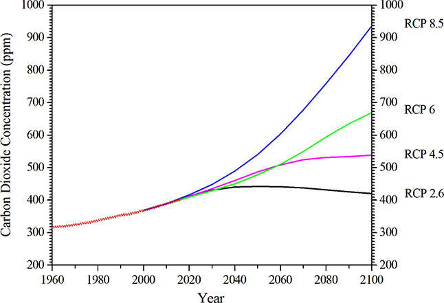
Figure 1.17. Global CO2 concentration from 1960–2100 for the four RCPs, overlaid with Mauna Loa historic CO2 data.
Download figure:
Standard image High-resolution imageWe can see that despite the new science and inclusion of more recent socio-economic data, such as the rise of China and India as major economic powers and the associated emissions, there is little difference between the higher end scenarios (A1FI and RCP 8.5) by the end of the century. For brevity, the following chapters of this book will use climate change projections based upon RCP 8.5, except in the case of more regional projections, which have not yet been updated, where A1FI will be used.
The UK has among the most detailed climate change projections in the world. The current iteration of these projections, compiled by the Met Office Hadley Centre, were released in 2009 and are termed UKCP09 (UK Climate Projections 2009). These predate the release of the IPCC 5th Assessment report, and hence are based upon the SRES emissions scenarios. However, they differ from many climate change projections in that they are probabilistic.
The UK Climate Projections 2009 are not solely based upon simulations of the UK Met Office Hadley Centre climate models; instead, they are based upon many different climate models from around the world. This collection of climate models is run many times with different estimates for uncertain processes in the models (referred to as perturbations). Uncertainty in climate models arises from the natural variability in the climate system, which is inherently random, our incomplete understanding of all of the Earth's climate processes, as well as uncertainty in future greenhouse gas emissions. This allows the collection of climate models to create a spread of results based upon the limitations of our current understanding. By combining the results into distributions of possible values or probability density functions (PDF) we can provide information about the relative likelihood of different future outcomes. This process is demonstrated graphically in figure 1.18 by comparing UKCP09 to the previous iteration of UK climate projections UKCIP02.
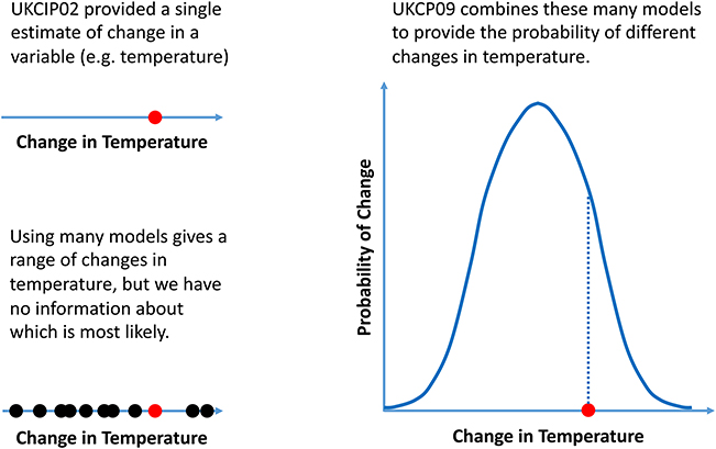
Figure 1.18. Illustration of how many climate model outputs are combined to form probabilistic estimate of climate change in UKCP09 2 .
Download figure:
Standard image High-resolution imageThe next iteration of the UK climate projections is planned to be released in 2018 (UKCP18) and will be based upon the RCP scenarios. Full details have not yet been made public but UKCP18 will consist of probabilistic data similar to UKCP09, but there will be greater emphasis on the representation and handling of extreme weather events within the projections.
1.5. Climate change impacts
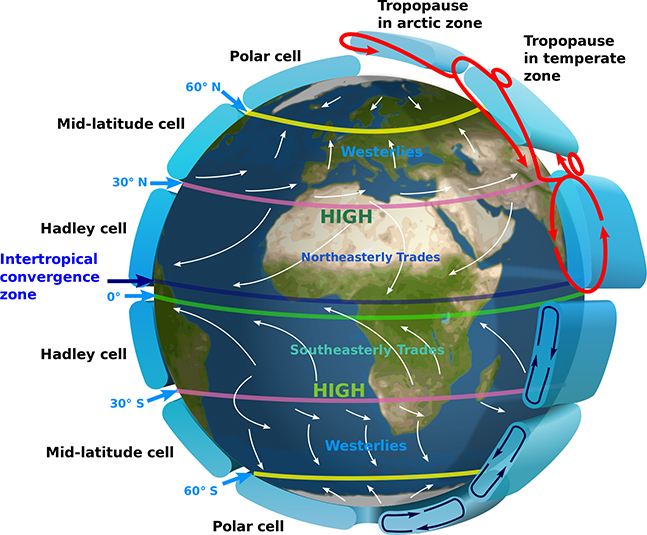
Within this book we talk about climate change and not global warming. Although the two terms are often used interchangeably in the media, this is not necessarily correct. The term global warming implies a global warming effect and could be interpreted to simply mean warmer temperatures, which, to those of us who live at higher latitudes, might be viewed as a good thing. However, the climate system is complex, and the weather we experience is driven by atmospheric convection currents, the magnitude of which is a function of the rotation of the Earth and the difference in temperature between the surface and the upper atmosphere and between the equator and the poles. As some areas warm, other areas are expected to cool, the difference in temperature between the land and oceans will increase due to different thermal inertias altering the weather experienced in different global locations. Changes to these can disrupt and alter these convection currents, changing global weather patterns. Therefore, the term global warming is not strictly true. Conversely, climate change is not just temperatures, but also sea level rise, changes to storms and monsoons, the persistence of droughts, or the melting of permafrost to provide arable land. Figure 1.19 shows an illustration of the atmospheric convection currents, which drive global weather patterns; each hemisphere has three convection cells, the Polar cell, the Mid-latitude or Ferrel cell, and the Hadley cell.
Figure 1.19. Illustration of the atmospheric convection currents that drive our climate system (courtesy of NASA).
Download figure:
Standard image High-resolution image
There is limited mixing between the atmospheric convection cells, and air exchange might only occur during certain conditions. For example, the ozone hole in the Antarctic polar cell is a result of limited exchange between the southern Polar cells and the Ferrel cell during the cold Antarctic winter, the so-called Polar Vortex. Furthermore, we can see from figure 1.19 that at certain places air is rising or falling, not travelling horizontally. It is for this reason that it was difficult for sailboats to cross the equator, as air rises vertically here and there is little horizontal wind giving rise to the 'doldrums'. Likewise, at the horse latitudes around 30° between the Ferrel cell and the Hadley cell, air is falling. These atmospheric convection currents are also responsible for the trade winds at sea and the prevailing winds we experience on land.
There is a similar pattern at sea. The global ocean convection currents, which carry warm water near the surface from the tropics towards the poles where it cools and sinks, are responsible for the timing, magnitude, and trajectory of monsoons in India, hurricanes in the Caribbean, and storms in the UK. The temperature of the ocean surface determines all these things. The El Niño Southern Oscillation is the warming of the ocean surface in the central and eastern tropical Pacific Ocean (La Niña refers to the cooling trend). This warming shifts the atmospheric circulation slightly, thus reducing rainfall over Indonesia and Australia while increasing rainfall and monsoons over the tropical Pacific Ocean. Changes to ocean surface temperature can have a dramatic effect on the weather experienced by different countries. A strong El Niño event recently produced a prolonged drought in Australia lasting several years, threatening Australian wine production along the Darwin. The Atlantic Ocean also exhibits a similar effect, the Northern Atlantic Oscillation (NAO). The series of intense storms experienced during the summer of 2012 in the UK were a result of a warmer than normal Atlantic surface temperature moving storm tracks southwards, which otherwise would have missed the UK and travelled on towards Iceland. It is important to note that climate change science has so far been unable to reach a consensus as to whether climate change will intensify or reduce the El Niño and NAO effects. However, it is clear that changes to the status quo has the potential to have very profound influences on global weather.
The IPCC states that 'the resilience of many ecosystems is likely to be exceeded this century by an unprecedented combination of climate change and associated disturbances (e.g. flooding, drought, wildfire, insects, ocean acidification)'. This is not just because of the magnitude of anticipated climate change, but also the speed at which it will happen. We have seen previously that the Earth has experienced variation in temperature and climate before, but it is important to understand that these changes occurred slowly over millennia, and ecosystems were able to adapt or migrate in response. The IPCC provide detailed estimates of the global impacts of a changing climate, some of which are summarised below.
Increased CO2 in the atmosphere and warmer temperatures will lead to increased plant growth, and hence increased CO2 uptake. However, if temperatures rise too high then plants begin to respire just like every other creature. Over the course of this century, net carbon uptake by terrestrial systems is expected to peak before the middle of the century, and then weaken or even reverse, leading to amplification of climate change. It is estimated that 20%–30% of plant and animal species are likely to be at risk of extinction if the average global temperature increase is greater than 1.5 °C–2.5 °C. For temperature increases exceeding this range, there are expected to be major changes to ecosystems and the interactions between species and a migration of species. This will result in a reduction in biodiversity, and will have impacts on water and food supplies.
Increased plant growth will lead to increased crop productivity at mid to high latitudes, with increased productivity depending upon temperature increase (1 °C–3 °C) and the crop in question. However, this will be balanced by reduction in crop productivity at lower latitudes. In seasonally dry and tropical regions, crop productivity is expected to decrease for even small increases in temperature (1 °C–2 °C). Globally, food production is projected to increase for a 1 °C–3 °C temperature increase, but decrease thereafter.
Climate change will also have the potential to affect the health of millions of people. Reductions in crop productivity would increase malnutrition and increase the burden of diarrhoeal diseases. Changes to weather patterns resulting in more severe storms and extreme weather events increase risk of physical injury. Changes to weather and climate will alter the global distribution of infectious diseases. In urban areas, increased concentrations of ground level ozone increases risk of cardio-respiratory diseases. There will be benefits as well; in temperate zones such as the UK, cold-related deaths in winter currently far outweigh heat-related illness in summer. Climate change will reduce the number of cold-related deaths in these areas, but higher summertime temperatures and increased instances and intensities of heat waves will result in more deaths in summer. In the short term, temperate areas should see reduction in temperature-related deaths. Globally, however, rising temperatures will result in increased mortality, especially in developing countries.
Changes to the frequency and intensity of precipitation will lead to increased stress on water resources, exacerbated by population growth and land-use change such as urbanisation. Changes to precipitation and temperature will increase surface water run-off. Run-off is projected to increase by up to 40% at higher latitudes and in some wet-tropical areas (e.g. Southeast Asia), but at the same time decrease by up to 30% over dry areas at the mid-latitudes and in dry-tropical areas, due to decreased rainfall and increased uptake and evapotranspiration by plants. Areas that are currently affected by drought are expected to grow in size, having an adverse impact upon agriculture, water supply, and human health. Climate research suggests that there will be a significant increase in future heavy rainfall events for many regions, even regions where the mean total annual rainfall is projected to decrease. This poses challenges to society in the form of floods, damage to infrastructure, and water quality.
Sea level rise due to thermal expansion of the oceans as they warm will threaten many low-lying coastal areas. The greatest increases in sea level will be in the densely populated mega-deltas of Asia and Africa, while small islands are particularly vulnerable and in danger of disappearing completely (e.g. Micronesia). In addition, thermal expansion increases sea levels due to stronger storms and greater storm surges. In the presence of a low-pressure system, the atmosphere exerts less force on the ocean surface, and the level rises. Storm surges in the UK can currently exceed 1 m in height, and stronger storms will be typified by even lower pressure systems and hence greater storm surges. This will pose particular problems for low-lying areas, especially those with dense urban populations. The most vulnerable societies, industries, and settlements are those in coastal and river flood plains, especially those where the economy is dependent on climate-sensitive resources and is sensitive to extreme weather events (e.g. harbours). Rapid urbanisation in these areas will exacerbate the risk from climate change.
The further chapters of this book deal with specific climate change risks and their impact on urban areas. As might be expected, there will be overlap and common solutions to some of the climate change-related issues. The final chapter aims to summarise these and tease out common solutions to increase the resilience of urban areas to climate change.
References
- [1]Hulme M, Jenkins G J and Lu X et al 2002 Climate Change Scenarios for the United Kingdom: The UKCIP02 Scientific Report, Tyndall Centre for Climate Change Research, School of Environmental Sciences (Norwich, UK: University of East Anglia) ISBN 0 902170 60 0
- [2]Jenkins G J, Murphy J M, Sexton D S, Lowe J A, Jones P and Kilsby C G 2009 UK Climate Projections: Briefing report (Exeter, UK: Met Office Hadley Centre) ISBN 978 1 906360 04 7