

Abstract
Global-average temperatures are a powerful metric for both long-term climate change policy, and also to measure the aggregate fluctuations in weather experienced around the world. However, here we show how the consideration of anomalies in annual temperatures at the global land-average scale, particularly during extremely hot years, tends to overestimate the perceived severity of extreme heat actually felt by local communities during these events. Thus, when global-mean temperatures are used as a proxy to infer the role of climate change on the likelihood of witnessing hot years, the component of extreme event risk attributed to human influence can also be overstated. This study suggests multiple alternative approaches to characterise extreme weather events which have complex spatial signatures, each of which improve the representation of perceived experiences from the event when compared with the default approach of using area-averaged time-series. However, as the definition of an extreme event becomes more specific to the observed characteristics witnessed, changes are needed in the way researchers discuss the likelihood of witnessing 'similar events' with future climate change. Using the example of the 2016 hot year, we propose an alternative framework, termed the 'Time of Maximum Similarity', to show that events like the record-breaking annual temperatures of 2016 are most likely to be witnessed between 2010–2037, with hot years thereafter becoming significantly more severe than the heat of 2016.
Export citation and abstract BibTeX RIS

Original content from this work may be used under the terms of the Creative Commons Attribution 3.0 licence. Any further distribution of this work must maintain attribution to the author(s) and the title of the work, journal citation and DOI.
1. Introduction
One of the clearest signs of the global climate system responding to the accumulation of anthropogenic greenhouse gas emissions can be found in the occurrence of exceptionally warm years in global-mean temperature records. Indeed, 2016 was identified as the hottest year in all reputable global temperature datasets (Knutson et al 2018), and '17 of the 18 warmest years on record have all been witnessed during this century' (Hartfield et al 2018). Consequently, several studies have employed techniques from the field of probabilistic event attribution to quantify the role of anthropogenic greenhouse gas emissions in changing the likelihood of experiencing such record-breaking hot years (Kam et al 2016, King et al 2016, King 2017, Mann et al 2017, Knutson et al 2018).
However, it is well-recognised that anomalously high annual temperatures at the global scale can translate to widely varying experiences for local communities in different parts of the world: while some locations will experience relatively severe local heat anomalies, others might actually have a normal or even cooler-than-average year. Therefore, when an attribution statement is made with regards to an event definition based on global-mean temperature anomalies, the extent to which this result actually translates to attributable changes in the impacts experienced by different local communities, the perceived severity, remains unclear (Otto et al 2018, Sillmann et al 2018).
This study presents a systematic investigation of the ways in which characterising human influences on an extreme weather- or climate-related event can differ depending on the spatial scales at which the severity of the event is defined. Using the record-breaking global hot year of 2016 as a case study, we explore issues which arise as a result of defining the severity of an extreme weather event in different ways. We then suggest some modifications to existing event attribution frameworks which emphasise preserving the complex spatial characteristics associated with damaging extreme weather events.
2. Data and methods
To investigate the spatial characteristics of annual temperatures observed across all land regions, monthly temperatures are taken from the CRU-TS 4.01 dataset at a horizontal resolution of 0.5° × 0.5° for the period 1901–2016 (Harris et al 2014). To consider the statistical properties of annual temperature anomalies at a global-average scale versus at the grid-scale in the context of future climate scenarios, temperature data is also extracted from 28 available models in the Coupled Model Intercomparison Project Phase 5 archive (CMIP5, Taylor et al 2012) for the period 1861–2100. 'Historical' and 'RCP8.5' simulations of monthly temperatures are used for the periods 1861–2005 and 2006–2100 respectively, before being spliced together and annual average temperatures calculated. For those models which ran more than one simulation of the same experiment type, only the first ensemble member (r1i1p1) is considered. For both the model and observation-based data, only grid cells with >50% land are analysed, excluding any regions south of 60 °S (due to a lack of robust historical observations). For any analysis where model-based and observation-based data were compared directly, annual temperatures were first regridded to a common resolution of 2.5° × 2.5° using nearest neighbour resampling.
We introduce several variations to commonly-used technical terms to help clarify different types of temperature anomalies for the reader. An absolute temperature anomaly hereafter refers to a time-series of absolute annual temperatures which have been normalised with respect to the mean temperature over a fixed baseline period of 1951–2010. Meanwhile, normalised or sigma temperature anomalies hereafter refer to that same time-series of anomalies being further divided by the corresponding noise (σ) of that distribution, which in turn is defined as the standard deviation of annual temperatures over the same 1951–2010 baseline period. No adjustment has been made to account for any warming trend over this period: this measure of noise is instead intended to reflect the variability actually experienced by people who lived through this time, and thus adapted to any changes in local climate over the period (Lehner and Stocker 2015, Frame et al 2017, Harrington et al 2017).
For both observations and models, we hereafter refer to global-mean or global-average temperatures as annual temperatures first averaged over all land grid cells only (subject to the above coverage restrictions), before anomalies are calculated. Meanwhile, normalised grid-scale anomalies are calculated with respect to local mean temperatures and noise over the same 1951–2010 period.
3. Understanding the 2016 hot year: global-average versus grid-scale characteristics
The record-breaking hot year of 2016 is used as a case study for the remainder of this analysis. Figures 1(a) and (b) present the local absolute and normalised temperature anomalies for this event. In both cases, it is clear that large fractions of the Earth's land surface experienced above-average temperatures, with large swathes of land across all continents showing anomalies of greater than 2 °C in figure 1(a). Meanwhile, the largest normalised anomalies in figure 1(b), which reach in excess of +2σ, are preferentially located in the high northern latitudes, with the majority of land regions witnessing anomalies of between +0.5σ and +1.5σ.

Figure 1. (a) Map of observed absolute annual temperature anomalies for the year 2016, relative to a 1951–2010 baseline. (b) Corresponding annual temperature anomalies also for the year 2016, but normalised at each grid point by the corresponding standard deviation (or Noise) in local temperatures over the same 1951–2010 period.
Download figure:
Standard image High-resolution imageTo better understand some of the key statistics of the 2016 hot year, figure 2 presents normalised histograms of the areal distribution of local anomalies, both in absolute (figure 2(a)) and normalised units (figure 2(c)), as well as the grid-scale distribution of local noise in annual temperatures over the 1951–2010 baseline period (figure 2(b)). In each case, the value experienced by the mean grid cell is highlighted as a brown vertical line, while the corresponding anomaly or measure of noise for the global-average dataset is shown as a teal vertical line.

Figure 2. (a) Aggregate PDF of land fractions exposure to specific anomalies in 2016 in absolute units (K). The thick brown line shows the global-average absolute annual anomaly for the year 2016; the thick teal line shows the corresponding value of the mean grid cell (not seen in panel (a) as directly overlapping the global-average value); and the 'globe-to-grid' ratio (hereafter named RatioG2G) is simply the ratio of these two values. (b) Same as panel (a), but showing the land fraction distribution of 'Noise' (or σ) in local annual temperatures, defined as the standard deviation over the period 1951–2010. Note the specification of 1/RatioG2G, which in turn represents to the 'grid-to-globe' ratio. (c) Same as panel (a), but showing the 2016 hot year land-area histogram for temperature anomalies in normalised units of local σ.
Download figure:
Standard image High-resolution imageWe find in figure 2(a) that the absolute local temperature anomaly for the mean grid cell for the 2016 hot year is, by definition, equal to the corresponding 'global-average' absolute anomaly. However, the measure of noise in global-average annual temperatures (0.45 °C) only amounts to 60% of the corresponding estimate of noise in local temperatures for the average grid cell (0.75 °C)—such a deflation in variability is a known statistical artefact of averaging temperatures across space before calculating variability in time. Consequently, this divergence is expressed as differences in the estimated severity of the 2016 hot year in units of σ—the normalised anomaly experienced by the average grid cell was +1.85σ, while the corresponding global-mean anomaly was +3.08σ. Such an inflation in the global-mean anomaly (1.85/3.08 = 0.6) was almost identical to the fractional difference in noise presented in figure 2(b).
3.1. Globe-to-grid temperature ratios in observations and models
To further examine differences in quantifying anomalously hot years, and specifically comparing the aggregate results of grid-scale normalised anomalies with the corresponding results within a global-mean context, we repeat the comparisons made for the 2016 hot year in figures 2(a) and (c), but this time for each of the 116 years available in the observational record. While a 1:1 relationship is confirmed between the absolute global-mean temperature anomaly observed in a given year, and the corresponding local anomaly found for the average grid cell, results show a robust (R2 = 0.98) deviation from this 1:1 line emerges for all 116 normalised annual temperature anomalies considered (figure S2 is available online at stacks.iop.org/ERL/14/024018/mmedia). Indeed, linear regression analysis reveals that when the average land grid cell experiences an annual temperature anomaly of Nσ, the corresponding anomaly found at the global-average scale will be approximately 1.65*Nσ (5%–95% range: 1.62–1.69). We hereafter refer to this inflation coefficient as the 'Globe-to-grid' ratio (or RatioG2G).
We can also calculate this ratio in exactly the same way for all 28 available CMIP5 models (see figure S3 for individual model results). Figure 3 presents a scatterplot comparing the RatioG2G (and corresponding uncertainty bounds) against the corresponding 'grid-to-globe' ratio (inverse of RatioG2G) of noise estimates, for both observations (red) and each of the available models.
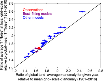
Figure 3. Scatterplot of the regression-based RatioG2G of annual local sigma anomalies (x-axis)—which corresponds to the gradient in figure S2(b) for the observations—against the fixed 'Grid-to-Globe' noise ratio (y-axis) calculated in figure 2(b). The large red circle shows the best-guess observational estimate, with the red line showing uncertainty in the linear gradient presented in figure S2(b). Blue filled circles are the corresponding results for individual CMIP5 models (see figure S3 for details); the four models which fall within the observed uncertainty range, and thus considered for subsequent analysis, are coloured with purple filled circles. All error bars relate to plausible uncertainty in the linear regression analysis, as shown in figure S2.
Download figure:
Standard image High-resolution imageSeveral key results emerge. First, there is a robust relationship between the RatioG2G in normalised annual temperature anomalies found for a given model (x-axis) and the corresponding ratio of noise found at the local scale for the average grid cell, relative to the corresponding global-average noise estimate (y-axis). This implies that the inherent dilution of noise—an artefact of averaging annual temperatures over all grid cells to form a singular global-mean temperature time series—is by far the primary driver of differences in the severity of a given hot year between the average land grid box and estimates at the global-mean scale.
Second, there is substantive diversity in the results for different models: most yield a RatioG2G of between 1.4–2.2, though MRI-CGCM3 exhibits a particularly high ratio of 2.46. Since no correlations were found between this metric and a model's resolution or equilibrium climate sensitivity (not shown), we posit that this ratio (and the differences between models) fundamentally represent a proxy metric of the persistence with which annual temperature anomalies emerge across spatial scales. For example, those models with higher ratios should produce particularly heterogeneous spatial patterns of anomalies for a given year, such that the year-to-year swings in global-average anomalies are relatively small and thus global-average noise in annual temperatures will be significantly smaller than the corresponding grid-scale average. Meanwhile, those models with lower ratios will have years which often exhibit significantly warm (and cold) anomalies over many regions of the world at the same time, such that the year-to-year swings in global-average anomalies are relatively more pronounced. Consequently, global-mean noise estimates will be larger and hence closer to the corresponding noise estimate for the average grid cell.
3.2. Implications for interpreting extreme events based on global-mean event definitions alone
Irrespective of the specific estimate obtained by each model, all globe-to-grid ratios are markedly higher than one, and this has potentially significant implications for interpreting the specific severity of a given hot year when framed in the context of global-average temperatures (Blunden and Arndt 2017, USGCRP 2017).
To emphasise the how results in figure 3 nonlinearly modify the estimated severity of an extreme hot year, we present the differences which emerge for hypothetical return periods of hot years between the average land grid cell and for global-mean temperatures, based on the grid-to-globe ratios found in figure 3. To enable such calculations, we make an assumption that annual temperatures approximate a Gaussian distribution (see figure S5 for supporting evidence), and then use the spread of RatioG2G estimates found in figure 3 to calculate the resulting return periods.
Results in figure 4 reveal a significant and non-linear impact of amplifying normalised sigma anomalies at the global scale when converting these hot year definitions to return periods. Using the observation-based RatioG2G of 1.65 (red line), we find that when a 1-in-10 hot year is experienced on average for local grid cells, the corresponding severity estimate for global-mean temperatures will be a 1-in-60 year event. These amplifications become even more pronounced for higher return periods: when the average land grid cell experiences a 1-in-50 year extreme heat anomaly, the severity for corresponding global-mean temperatures will approximate a 1-in-3000 year event, which is a 60 fold reduction in recurrence frequency.
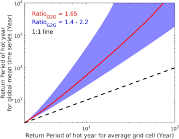
Figure 4. Schematic illustration of the inflation which arises in defining the severity of extreme hot years for global-average temperatures, relative to the corresponding return periods of local heat anomalies which are experienced by the average grid cell (note the logarithmic scales). Blue shading indicates the spread which arises from different RatioG2G estimates found by different CMIP5 models; the red line indicates the best-guess estimate based on the observational RatioG2G of 1.65; the black line shows the 1:1 relationship between the x-axis and y-axis.
Download figure:
Standard image High-resolution imageThese results are concerning, as they suggest local decision makers could mistake the recurrence frequency with which a specific event might be expected in the future. If the local impacts associated with this hypothetical hot year—such as increased heat stress-related morbidity or mortality rates—are assumed to be so rare that they will only be witnessed, on average, every 1-in-3000 years, then local decision makers will not view such impacts as commonplace and thus might be reluctant to invest in related resilience measures. But if such an anomalous hot year is in fact expected to occur much more often in their community than an area average-based severity estimate suggests, the lack of investment in resilience will lead to potentially devastating (and preventable) heat-related impacts from subsequent events (Mitchell et al 2016, Gasparrini et al 2017). Examples can already be found with the application of pan-European estimates of changing heatwave frequencies (Stott et al 2004, Christidis et al 2015) to inform climate change risk assessments (ASC 2017) and adaptation planning (Public Health England 2018) in the United Kingdom.
3.2.1. Implications for attributing the role of anthropogenic climate change on the local impacts of a specific hot year
Alongside the risk of local decision makers misinterpreting how often they should prepare for witnessing local hot years, the divergence in event severity estimates between global-average temperatures and the corresponding average grid cell will also exacerbate the perceived attributable role of human influences on local impacts of an anomalously hot year. Several published examples have demonstrated that, when considering Gaussian distributions, the risk ratio associated with a given climate change-induced shift in a temperature distribution will be amplified in proportion to the return period of the event threshold being considered (Harrington and Otto 2018, Kharin et al 2018). Angélil et al (2018) have also demonstrated how risk ratios can be substantially higher for global-mean temperature anomalies relative to the risk ratios for corresponding grid-scale anomalies, even when comparing a fixed return period for both examples. The results of figure 4 and previous research collectively emphasise an important result for decision makers: calculating the increased likelihood of experiencing global-mean temperature anomalies comparable to an observed hot year will yield risk ratio estimates which have no clear relationship with the actual attributable change in impacts experienced by local communities as a consequence of that hot year. These cascading effects of discussing extreme event characteristics using different metrics and with different spatial scales are summarised schematically in figure 5.
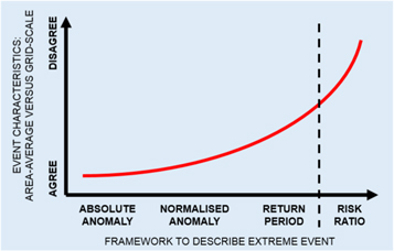
Figure 5. Schematic illustration of the compounding differences which emerge when characterising an extreme event in different ways: specifically, when comparing agreement in the severity (or risk ratio) of that event which was experienced by the average grid cell, relative to corresponding results using a spatially-averaged time series. The black dashed line represents the slight distinction between risk ratios and the other frameworks to define an event's severity—though we reiterate that differences between area-averaged risk ratio estimates and those found for the average grid cell result directly from disagreement in estimates of the event's return period.
Download figure:
Standard image High-resolution imageIt is also important to note that many attribution studies may not necessarily focus on global-average anomalies as a proxy to discuss attributable changes in extremes at the local scale, but often instead focus on regional averages (Christidis et al 2015, Herring et al 2016, 2018, Kharin et al 2018). By virtue of statistics, such approaches will exhibit the same qualitative issues as those presented in figures 3 and 4 (Angélil et al 2014, 2018), albeit with less dramatic inflation ratios.
4. Alternative methods to define an extreme hot year
Instead of averaging temperatures across all land grid cells to produce a singular proxy estimate of the severity of an anomalously hot year (i.e. global-mean temperature anomalies), we hereafter propose two alternative frameworks to characterise the severity of an extreme hot year with complex spatial characteristics.
The first is the Perkins Skill Score (or PSS, following Perkins et al 2007) which focuses on the aggregate distribution of normalised local temperature anomalies but does not preserve information about where these anomalies happened in space; the second is the root mean square error (RMSE) metric, which captures information on both the aggregate distribution of local sigma anomalies witnessed for a specific year, as well as preserving information about the geographic distribution of these anomalies during the event. Each of these metrics may be preferable to different stakeholders depending on whether information is being considered for decision making at local or regional scales.
The focus on normalised local temperature anomalies, as opposed to absolute local temperature anomalies for these subsequently proposed metrics is an acknowledgement that most discussions relating to extreme weather events—both in the scientific literature and general public discourse-are framed in the context of either return periods, whether records have been broken, or how far a given event deviates from what is considered 'normal' (Lehner and Stocker 2015, Otto 2017). Since both the climatology and year-to-year variability of different regions in the world can differ dramatically in the context of annual mean temperatures, the authors argue that the best way to characterise the collective severity of an extremely warm year worldwide is to consider the aggregate distribution of locally normalised temperature anomalies (Frame et al 2017, King and Harrington 2018).
Finally, we emphasise that for all subsequent calculations, both model-based and observation-based sigma anomalies have been regridded to a common 2.5° × 2.5° horizontal resolution, and only those four CMIP5 models which accurately captured the observed RatioG2G were considered for analysis.
4.1. Perkins skill score
Following Perkins et al (2007), the PSS calculates the percentage overlap in the distributions of aggregate normalised temperature anomalies between the observed event of interest (such as the anomalous hot year of 2016; see figure 2(c)) and a random year, in from the model simulations or the rest of the observational record. Expressed formally,
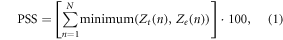
where N is the number of bins used to calculate the PDF for a given region, Zt(n) is the frequency of values in a given bin (n) from a randomly chosen year, and Ze(n) is the frequency of values in the same bin from the observed hot year of interest. Similar to the 'distinguishability' metric proposed by Suarez-Gutierrez et al (2018), the PSS metric is bounded between values of 0% and 100%, with higher values indicating a closer agreement between the observed PDF of normalised temperature anomalies for the corresponding anomalies for the randomly chosen model year.
4.2. RMS errors of normalised temperature anomalies
A second metric which measures the similarity in spatial maps of normalised temperature anomalies is the RMSE (Wilks 2006). This is defined formally as,
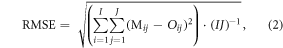
where Mij and Oij respectively denote the local normalised temperature anomaly at a specific location [i, j] in the randomly chosen model year and observed year of interest, and I and J denote the number of latitude and longitude gradations in the gridded dataset (72 and 144 respectively for the 2.5° × 2.5° resolution of this analysis). A low RMS error score indicates better agreement in the spatial distribution of normalised temperature anomalies between the observed event of interest and the corresponding model year being considered. Note that only grid cells over land and north of 60 °S were considered in the RMS error calculations.
5. Rethinking unique extreme events and their recurrence in a warming climate
When returning to the case study of the 2016 hot year, the new methods to identify 'similar-looking' years through time yield several interesting results. Figures 6(a) and (b) present, respectively, the time-evolution of the PSSs and RMS errors for the map of local normalised anomalies (figure 1(b)) against the corresponding patterns for each of the other 115 years available in the observational record, as well as for all years in the 20th and 21st century for those four models with a RatioG2G most closely resembling the observational record. Prior to 1980, we find PSSs varying between 10% and 30%, and RMS errors fluctuating between 2 °C and 3 °C. However as global warming continues through the late twentieth century, the areal overlap between the PDF of a random year's temperature anomalies and the sigma anomaly distribution of 2016 begins to increase significantly (alongside corresponding, though less dramatic, decreases in RMSE). During both these periods of evolution, there exists robust agreement in PSS and RMS errors between the observations and corresponding model simulations.

Figure 6. (a) Time-series of Perkins Skill Scores for each annual map of sigma-normalized temperature anomalies, relative to the 2016 event. Red lines show all observational years between 1901–2015. Purple lines show results from the four 'good' models for each year between 1861 and 2100 (as defined in figure 3). (b) Same as panel (a), but showing time-series' of RMS errors for each observed and model year. Grey shaded regions show the 'Time of Maximum Similarity', or ToMS, which denotes the range of years where models exceed the 'similarity' threshold for each of the respective metrics.
Download figure:
Standard image High-resolution image
As climate warming continues through the early decades of the 21st century, there is a peak (trough) in PSSs (RMS errors) reached, before the metrics diverge later in the century (indicating incompatibility with the anomaly patterns of 2016). These results reflect several key differences which emerge when discussing more event-specific frameworks to characterise the hot year of 2016. First, as collective global warming continues to climb under the high-emissions RCP8.5 pathway, the distribution of temperature anomalies continue to warm such that every other year in the 2020s and 2030s exhibits more than 80% agreement in their fractional distribution of anomalies with what was witnessed in 2016. The model-based RMS errors also reach their lowest values during these same decades, indicating the specific geographic patterns of normalised anomalies reach their optimum resemblance to the geographic patterns witnessed in 2016 at the same time as for the PDFs of aggregate anomalies.
However, we note that even for the 'best-fitting' model year (figure S5), the PSS does not exceed 90% (figure S6) and as much as 26% of land regions show more than a 1σ difference between the modelled anomalies and actual anomalies of 2016 (figure S7). Such results provide evidence of potential upper bounds, and thus limitations, which exist when utilising climate models to represent analogues of the observed impacts from any specific hot year.
Finally, as the distribution of local annual heat anomalies continue to become more and more severe later in the century, shifts beyond the 2016-specific distribution of anomalies occur, with the average sequence of anomalies found for the 2080s consequently no longer bearing any resemblance to the anomalies of 2016 (they are in fact much, much more extreme).
5.1. Defining the time of maximum similarity (ToMS)
As warming continues into the second half of the 21st century under an RCP8.5 scenario, the progressive decline in resemblance of modelled annual anomaly patterns to the 'event' of 2016 poses a challenge in interpreting how often '2016-like' heat anomalies will be witnessed in a warmer climate. This is a particularly unique challenge when compared to the more orthodox methods of considering monotonically increasing projections of extreme temperatures, or exceedances of a specific area-averaged temperature threshold.
To circumvent such interpretation issues, we hereafter propose a new metric, termed the 'ToMS', to characterise the temporary period when the resemblance to the extreme event of interest reaches its peak. This can be thought of as a modification to the 'Time of Emergence of New Normal' framework proposed by Lewis et al (2017), but adapted to more closely capture specific spatial characteristics of a given extreme event.
For the very specific case of aggregate grid-scale normalised annual temperature anomalies, we propose the ToMS to be the range of years for which PSSs exhibit exceedances of 80%, and RMS errors fall below 1.25 °C (each of these thresholds approximately correspond to the 95th percentile of each metric when considering all years across all models and observations together). However, such thresholds are subjective: any application of the ToMS framework to other types of extreme event would therefore require thresholds to be adjusted (with supporting justification), as well as the reasons for changes beyond the ToMS period to be well-understood.
As figure 6 reveals, we find a ToMS for the 2016 hot year of 2010–2037 based on PSSs, and 2004–2037 based on RMS errors. The agreement across metrics suggests a lack of sensitivity of the ToMS framework to whether or not the specific geographic location of the temperature anomalies are considered. We further emphasise that, unlike previous measures of 'Time of Emergence' (Hawkins and Sutton 2012) which are often presented as a specific year with corresponding uncertainty bounds (Lyu et al 2014), the range of years presented for the ToMS should not be interpreted in an equivalent way. That is, the metric is not intended to denote a specific individual year, but instead a range of years (if not decades) where witnessing '2016-like' hot years will be most likely to occur.
As a supplementary example of the ToMS concept, we consider results for a hypothetical hot year in the future in which the patterns of local normalised anomalies witnessed for the 2016 event have been exacerbated by a further +1σ anomaly at each grid box (figure S8). The ToMS for this example is found to be 2024–2049 and 2025–2049 for the PSS and RMSE metrics, respectively (figure S9). Aside from again demonstrating the consistency of ToMS estimates across metrics, these results also show that only one or two additional decades of warming (under RCP8.5) is needed to witness a transition from the hot year of 2016 being commonplace, to when the 2016 hot year along with an additional +1σ of added severity becomes the norm.
5.2. Relevance for other extreme event analyses
The primary motivation for this analysis concerns the artificial inflation in the perceived severity of an observed extreme event, which arises as a statistical artefact of considering a singular time-series as representative of a large spatial domain where the 'event' happened (Kennedy and O'Hagan 2001). This criteria—characterising an extreme event by first averaging over a large spatial domain—is not unique to the specific example of extreme global hot years presented in this study. Consequently, the key results of figure 4 are but a specific example of a more general issue which afflicts many analyses of extreme weather events in the peer review literature: any extreme event which is characterised using an area-averaged time series will exhibit a more severe return period than what was witnessed for the average grid cell within that spatial domain.
Relevant researchers therefore need to make explicitly clear the extent to which calculating an event threshold, and consequently an attribution statement, is an accurate representation of the effects experienced by local communities during that event. Rather than the default qualitative statement that 'signal-to-noise ratios from climate change will be smaller for smaller spatial scales', the methods presented in this study (and particularly the calculation of RatioG2G) provide a useful framework for researchers to quantify the discrepancy between attributable impacts at the scale of individual grid cells, and the corresponding attributable impacts when averaging over a much larger domain size.
6. Conclusions
Understanding the influence of anthropogenic climate change on the frequency or intensity of extreme weather events can be a complex task: not only are the spatio-temporal characteristics of each event fundamentally unique and therefore complex, but so too are the ways in which the effect of global warming will project itself onto the event. A useful method to alleviate some of this complexity, particularly in the context of probabilistic event attribution, is to first reduce the dimensionality of the event itself, thereby simplifying the framework for analysis. In the context of extreme hot years, this is often achieved by considering a singular time-series which has been averaged over the spatial domain of interest. However, this act of simplifying the spatial characteristics of the event leads to an inadvertent reduction in perceived climate variability, relative to when all variations in weather at the grid-scale are preserved (figure 2). This results in the severity of the extreme event being overstated, relative to the severity which was actually experienced at the local level. Consequently, planners might mistakenly assume the 'event' will only be witnessed very rarely in the future, when the actual frequency of recurrence may in fact be much more common.
Focusing on the specific example of extreme global hot years to illustrate such a concept, this study first presents an observational estimate of the extent to which looking at global land-average temperature anomalies inflate the severity of a given hot year, relative to what is experienced by the average land grid cell. Not only do we identify a robust 'globe-to-grid' ratio in normalised annual temperature anomalies of approximately 1.65 (1.62–1.69), but also demonstrate how differences between local heat anomalies witnessed for the average grid cell versus corresponding anomalies at the global-mean scale can lead to non-linear disparities in the estimated return period of a given extreme event.
Since this dilution of local-scale climate variability is an inherent symptom of area-averaging any extreme event prior to further examination, we have instead proposed two alternative approaches to define an extreme hot year (section 4), each of which ensure the preservation of the spatial features of the event to varying degrees. Model-based results for both the PSS and RMS error metric reveal that the patterns of local temperature anomalies witnessed in 2016 were in fact more likely to have occurred in the present decade than any other time in the past or future (under a high-emissions RCP8.5 scenario).
The proposed framework to embrace the unique characteristics of an extreme weather-related event when analysing changes in the context of a warming climate—termed the 'ToMS'—necessitates a change in how event attribution science is interpreted by both scientists and decision makers alike. No extreme weather event simulated by freely-evolving climate models will perfectly reproduce the impacts of a damaging event experienced within the real world (figure S7). But by identifying when it is most likely to witness future instances of climate anomalies which bear a close resemblance to an observed extreme weather event (or, in fact, a synthetic 'event' which might be even more severe), adaptation planners can begin to understand and prioritise how rapidly measures to improve the resilience of local communities will need to be implemented. As the world continues to warm, updating and improving the methods used to inform such decision making will only become more important for the climate science community.
Acknowledgments
The authors acknowledge the World Climate Research Programme's Working Group on Coupled Modelling, which is responsible for CMIP, and thank the climate modelling groups for producing and making available their model output. For CMIP the US Department of Energy's Program for Climate Model Diagnosis and Intercomparison provides coordinating support and led the development of software infrastructure in partnership with the Global Organization for Earth System Science Portals. LJH acknowledges support from the MaRIUS project: Managing the Risks, Impacts and Uncertainties of droughts and water Scarcity, funded by the Natural Environment Research Council (NE/L010364/1). SP-K is supported by Australian Research Council grant number FT170100106. ADK is supported by Australian Research Council grant number DE180100638. SL is supported by Australian Research Council grant number DE160100092.