
Abstract
Teaching prismatic colours usually boils down to establishing the take-home message that white light consists of 'differently refrangible' coloured rays. This approach explains the classical spectrum of seven colours but has its limitations, e.g. in discussing spectra from setups with higher resolution or in understanding the well saturated colours of simple edge spectra. Besides, the connection of physical wavelength and colour remains obscure—after all, colour and wavelength are not equivalent. In this paper, we suggest that teachers demonstrate these impressive experiments in the classroom by using a video projector and a prism to disperse black-and-white slit images. We introduce experimental and diagrammatic methods for establishing the connection between the original slit image and the wavelength composition of the resulting spectrum. From this (or any other given) wavelength composition, students can systematically derive the colours with a simple RGB approach, thus gaining a more accurate picture of the relation between wavelength and colour.
Export citation and abstract BibTeX RIS
1. Introduction
The sight of a rainbow forms a unique aesthetic experience. Sunlight produces a ring of colours against the dark background of some rain clouds—a fascinating drama that has a fixed place in the iconography of western culture, cf Genesis 9, 13. Likewise, the demonstration of prismatic colours in classroom experiments is an impressive experience, with possible links to topics ranging from biology and technology to art. Our modern understanding of light and colour goes back to Isaac Newton's explanation of the Sun's spectrum. Using his laboratory as a pinhole camera, Newton projected the Sun onto a screen. A prism at the hole turned the circular image into a longer shape with semicircular ends [1, Book I, Part II Prop. III, Prob. I]. With the lengthening, the image was coloured like a rainbow (figure 1): red–yellow–green–blue–violet. He concluded that white 'light consists of Rays differently refrangible', with a 'disposition to exhibit this or that particular colour' [2, pp 3079 and 3081]. He proved his ray concept with a crossed-prism experiment: a second prism, perpendicular to the first, shifts the colours of the original spectrum as expected—orthogonal dispersion yields a diagonal spectrum. Newton's explanation of the rainbow-coloured spectrum has become canonic and even iconic.

Figure 1. Top: the classical experiment—a parallel band of white light falls through a prism and decomposes into the 'colours of the rainbow'. However, the colours depend on the screen position: positions close to the prism obtain only red–yellow and cyan–blue colour fringes. The green section of the spectrum develops as the fringes overlap. Bottom: the complementary experiment according to Goethe: sunlight falls through a prism and the shadow of an obstacle transforms into a spectrum of cyan, blue, red–magenta and yellow.
Download figure:
Standard image High-resolution imageUnfortunately, student textbooks hardly mention that this spectrum is a special case. In his own exploration of the field, Goethe described a whole progression of spectra (e.g. §§ 214–7) [3]: closely behind the prism, the image is still white, only with a red–yellow fringe on one side, and a blue–violet fringe on the other (figure 1, top). Further away, these colour fringes overlap to produce Newton's spectrum. Yet the fringes will overlap even more, leaving only red, green and violet. The same progression of spectra appears when we inspect the receding aperture through the prism. Accordingly, any white figure, shrinking in a dark surround, develops this progression of colours when we inspect (or project) it through a prism. Additionally, with a dark figure, shrinking in a white surround, Goethe also found a complementary progression of spectra [3, loc. cit.] and described how even these proceed from the fringe colours (figure 1, bottom).
Newton explained the fringe colours as a mixture of rays. In an analytical ray sketch, he would identify all the colour rays striking a given point on the screen (figure 2). On his colour circle, he would mark these rays according to quality and quantity, and mix them by finding their common barycentre. For example, red, orange, yellow and green rays compose the yellow part of the colour fringe. However, this complicated method obstructs our overview of the Goethean progression of spectra. Moreover, the modern treatment of mixing coloured lights has become more accurate, with the paradigm shift from colour rays to wavelengths of light. Unfortunately, the modern method of calculating three-dimensional colour coordinates [4, 5] from the spectral signal is far too complex for high school physics students. Yet, how can we transparently explain the whole progression of prismatic colours in terms of wavelengths?
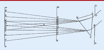
Figure 2. Newton's figure 12 from [1]. The slit F–ϕ is projected by means of perfectly parallel light to different screen positions (M–N and m–n). Depending on the distance between prism and screen the monochrome images P–π, Q–χ etc overlap more or less. Reproduced from [1] with permission from Dover publications.
Download figure:
Standard image High-resolution imageWhereas schoolbooks hardly distinguish colour and wavelength, Newton's analysis reveals how crucial this distinction is. In the classical spectrum, yellow is due to yellow rays only (or in modern words: a small range of wavelengths); yet in the colour fringe, yellow is due to red, orange, yellow, and green rays (i. e. a wide range of wavelengths). Obviously, the canonical view taught in physics classrooms is too narrow to comprehend the complex relationship between light and colour, given the metamerism of colour vision. A more satisfying introduction to the realm of prismatic colours should therefore clearly distinguish between wavelengths and colour.
Thus, for our course we will clearly distinguish between the wavelength distributions involved in spectra and the resulting colour phenomena. In this line of argument, we first introduce a diagrammatic analysis of the wavelength composition of spectra. These Dispersion Diagrams generalize both Newton's conceptualization of the spectrum as a composite image, and his crossed-prism experiment. Then, we systematically interpret the wavelength composition colourwise, choosing a simple RGB approach. As we investigate spectra from slits and obstacles of varying width, our method allows us to relate the geometry of the undispersed image to the wavelength distribution and colours of its spectrum. Moreover, these diagrams allow us to grasp the striking complementarity within and among spectra.
2. How edge spectra arise—monochrome images within spectra
Under daylight conditions, a simple way to prepare prismatic fringe colours is to close one eye and look through a prism out of a window. We may then see a red–yellow fringe emerging on one side of the window frame, and a blue–cyan fringe on its other side. For a projected version we may use a standard video projector whose spectral properties are similar to those of a thermal light source. For the projection we draw an image with a vertical black-and-white edge using standard drawing software (figure 3(a)). For Goethe's colour fringes we project this pattern through an Amici prism with horizontal dispersion (b). Thus, we obtain flamboyant colour fringes. They typically arise in two complementary versions: depending on the order of black and white in relation to the prism we obtain black–red–orange–yellow–white or white–cyan–light blue–dark blue–black. Again, from the perspective of 'wavelength=colour' we might be surprised by the phenomenon—how would this simple setup produce the wavelength separation necessary for these beautiful and distinct colours and why are there only parts of the rainbow spectrum? In other words: what is actually the wavelength distribution within an edge spectrum?

Figure 3. Projected complementary pattern (a) and the edge spectra produced by inserting an Amici prism in front of the video projector (b). There are two complementary colour transitions: black–red–orange– yellow–white and white–cyan–light blue–dark blue–black, depending on whether the respective edge is white–black or vice versa. At any horizontal screen position we find complementary colours adjacent to one another. Adding narrow-banded filters (approx. 620 nm (red), 546 nm (green) and 436 nm (blue)) reveals coloured images of the original pattern—monochrome images ((c)–(e)). However, the horizontal shift due to dispersion is different for different wavelengths. Here, monochrome images of shorter wavelength are projected more to the right and vice versa.
Download figure:
Standard image High-resolution imageTo isolate single wavelengths we introduce narrow-band filters (FWHM≈10 nm) [6]) in front of the spectrum. We find complete and sharp images of the original pattern, coloured like the respective filter. However, the red, green, or blue images will appear at different horizontal positions (figures 3(c)–(e)). In our example, we see images of shorter wavelengths (blue) towards the right, longwave images (red) towards the left. With filters of intermediate wavelengths the images appear at intermediate positions. Let us define such narrow-banded images as monochrome images. Without a prism, all monochrome images coincide, producing the original pattern. The effect of the prism is to disperse monochrome images of the original pattern into different directions.
In both versions of the edge spectra (figure 3(b)), the screen remains dark where there are no monochrome images. Conversely, white spaces arise where all possible monochrome images overlap. The colours appear where only part of the monochrome images overlap. This raises the question of which monochrome images constitute the particular colours.
3. Dispersion diagrams
Looking back at Newton's sketch (figure 2) we recognize that the rays connect the edges of the aperture F and ϕ with the edges of its monochrome images. For example, the most refracted rays delimit the shortwave image P − π, the least refracted rays delimit the longwave image T–τ etc. This allows us to identify which monochrome images overlap at a given position on a screen. On either screen, no images appear above point P or below point τ, leaving the screen dark there. Conversely, on screen M–N all monochrome images overlap between T and π, giving rise to white. On screen m–n this will not occur because it is positioned left of point X where the outermost projections P–π and T–τ start separating.
To understand which monochrome images overlap to produce the individual prismatic colours, we will use diagrams. For an overview, we plot wavelength versus monochrome image position—intuitively speaking, we stack the images according to wavelength. Figure 4 illustrates schematically the distribution of monochrome images for the colour fringes. Above the diagram we depict the original pattern, a white figure of width L in a dark field. The horizontal axis represents a section across the colours of the spectrum. The vertical axis represents the visible range of wavelengths. Linear dispersion shifts monochrome images proportionally to their wavelength. Shortwave (blue) images are located towards the right, longwave images towards the left (as in figures 3(c)–(e)). Each monochrome image has the width L of the original pattern, yielding a parallelogram structure in the diagram.
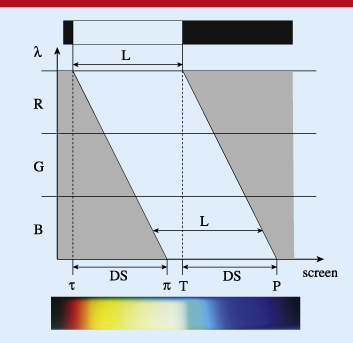
Figure 4. Schematic diagram ('Dispersion Diagram') of the spectral situation for an edge spectrum (from figure 3(b)). The x-axis denotes the lateral position within the projection on the screen. On the top we see a schematic view of the original pattern, basically a slit image of width L. Projection through an idealized prism with linear and horizontal dispersion will produce a set of evenly shifted monochrome images, each depicting the original slit image of width L. Here, like in figure 3, shortwave monochrome images are shifted more to the right than longwave images. The colour transitions occur in the ranges τ–π and T–P, cf figure 2 and text. The length τ–π (or T–P) is the Dispersive Spread (DS)—the (maximum) shift that occurs between monochrome images of minimal and maximal visible wavelength. Obviously, DS is the width of the colour fringes on the screen. The range π–T appears white since all monochrome images overlap, cf figure 2.
Download figure:
Standard image High-resolution imageOn the screen, the range τ–π represents the black–red–yellow–white transition and the range T–P the white–cyan–blue–black transition described above. To the left of position τ and to the right of position P the screen will appear dark since there are no monochrome images. Between the positions π and T all monochrome images of the pattern overlap—this section will appear white. If we traverse the range τ–π from left to right, the illumination of successive positions will include more and more shortwave monochrome images. Vice versa, if we traverse the range T–P from left to right, the illumination of successive positions will exclude more and more longwave images. We will call a diagram of this type a Dispersion Diagram. Such a Dispersion Diagram displays the spectral situation on the screen for a path through the spectrum in the direction of dispersion. Much like in Newton's diagram (figure 2), for each screen position we may collect the monochrome components of the local illumination.
4. A modern experimentum crucis
It is rather straightforward to demonstrate Dispersion Diagrams experimentally. To separate the monochrome images according to wavelength, we can disperse a given spectrum once more, but in a perpendicular direction. As mentioned above, Newton devised his crossed-prism experiment with the purpose of demonstrating specific refrangibility. Each colour within the spectrum of the image of the Sun is repeatedly refracted in a regular manner, giving rise to a diagonal spectrum. For our purpose of identifying the wavelength composition of any given spectrum, we use a fine diffraction grating with vertical dispersion (1000 lines mm−1) to ensure good spectral resolution (figure 5, top). For an analysis analogous to figure 4, we project a wide but flat slit. The prism produces a horizontal edge spectrum (figure 5, bottom). The spectrum appears unchanged in the diffraction order m = 0, together with its analysis in the diffraction order m = 1.
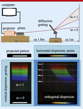
Figure 5. At the top is our experiment for a direct demonstration of Dispersion Diagrams. A prism with horizontal dispersion and a diffraction grating with vertical dispersion are combined. On the screen we find both the unmodified image of the horizontal edge spectrum (diffraction order m = 0) and an image with additional vertical dispersion due to first order diffraction. Right: the edge spectrum consists of monochrome slit images that are shifted horizontally according to their particular wavelength. The resulting display is a Dispersion Diagram. For a given position within the edge spectrum the (m = 1)-spectrum displays the constituent monochrome images (i.e. the constituting wavelengths).
Download figure:
Standard image High-resolution imageThe effect of the vertical dispersion of the grating is demonstrated in figure 5, bottom. A projection of the white slit image without a prism results in a vertical spectrum (left). Its good resolution makes it appear like a band of only red, green and blue. Note that, contrary to refraction, the displacement due to diffraction is stronger for longwave (red) than for shortwave (blue) images of the original pattern. Moreover, the monochrome images of the slit undergo an almost linear dispersion. A projection with a prism introduces horizontal dispersion (right). For the diffraction order m = 0, this transforms the slit image into an edge spectrum. For the diffraction order m = 1, the vertical stack of monochrome images is sheared horizontally, resulting in a curved shape due to nonlinear prismatic dispersion. Here, we can recognize the edge spectrum as a superposition of horizontally shifted monochrome images—the vertical dispersion resolves the horizontal superposition of monochrome images, thus fulfilling our purpose of stacking these images according to wavelength.
5. Simulating prismatic colours
We are now in a position to address the question of how prismatic colours arise. As should be reasonable from figures 4 and 5, the distinct and saturated colours within edge spectra result from the superposition of multiple monochrome images, i.e. a broad-banded wavelength signal. In the Dispersion Diagram, we can directly see which images superpose to produce a given colour. How can we understand the connection between image superposition and colour? Here, we revert to our observation that the resolved monochrome images appear either red, green, or blue. Thus, we may interpret the superposition of monochrome images as a superposition of red, green and blue images. Accordingly, the laws of additive colour mixture will determine the colours of spectra. We shall explore this idea.
Figure 6 explains the idea practically. Assuming the wavelength intervals R (600 nm–700 nm), G (500 nm–600 nm) and B (400 nm–500 nm), we can equate the contributions from red, green and blue images with the percentage to which these wavelength intervals are filled, respectively. Because all monochrome images overlap between positions d and e, all three wavelength intervals are filled 100%, there. This corresponds to the RGB-triple (1, 1, 1), so the screen will appear white in this section. Conversely, each of the wavelength intervals is vacant at positions left of a, and right of h. This corresponds to the RGB-triple (0, 0, 0) for these sections.

Figure 6. We may assign RGB-colours to screen positions with the following procedure. At screen position b we find 50% of the possible monochrome images from the red wavelength interval and neither green or blue contributions. Therefore, the corresponding RGB-value of this particular screen range would be (0.5, 0, 0)—see the text for more examples. Bottom: the resulting colour gradient is compared to the photographed edge spectrum from figure 3(b). Despite the involved simplifications and the use of only five colour steps, the RGB-procedure reproduces the main colour steps and the overall impression quite well.
Download figure:
Standard image High-resolution imageFor the colours of other screen areas we likewise consider the wavelength intervals R, G, and B as separate 'input channels'. For example, at the screen position b, the interval R is filled 50%, whereas intervals G and B are vacant. Therefore, we assign the RGB-triple (0.5, 0, 0) to that screen position, corresponding to the dark red we can see there. At position c, we find 100% of the possible red (but no green and blue) contributions, which translates into the RGB-triple (1, 0, 0), a bright red. Analogously, at position f we find 50% of the possible red monochrome images, and 100% of both the possible green and blue images. There, the corresponding RGB-triple is (0.5, 1, 1), a faint turquoise. For position g, a similar consideration yields the RGB-triple (0, 1, 1), a bright cyan.
If we use an RGB-mixture at discrete steps in the x-direction, the calculated colour sequence simulates the actual spectrum (figure 6, bottom). Even a crude procedure with only five colour steps for each colour fringe reproduces the actual colour sequence quite well. However, the yellow and blue regions are actually wider than predicted. For a correct representation, we should take into account that the prism has distinctly nonlinear dispersion, contrary to the diffraction grating (figure 5): As the experimental Dispersion Diagrams show, the prism tends to shift shortwave images increasingly more than longwave images. This stretches the yellow and blue regions, where shortwave images are still absent or present, respectively.
As a first result, the discussion of edge spectra in the framework of Dispersion Diagrams makes the complementary structure of the two types of colour fringes easy to understand. In our edge spectrum, any two screen positions with distance L correspond to complementary superpositions of monochrome images (cf figure 6), i.e. the two sets of monochrome images at the respective positions add up to a complete set of monochrome images ranging across the entire visible spectrum. The RGB approach translates this spectral lawfulness into a regularity of colours: any two screen positions with distance L are of complementary colour, i.e. the additive mixing of the two colours yields white.
6. Complementarity within spectra
From the outset, Goethe's approach to colour theory included the perspective on complementarity. He realized that the two edges of an edge spectrum can be interchanged—with such a geometry we obtain spectra not from slits but from obstacles (figure 7). Substituting the slit with an obstacle inverts the original pattern. With our chessboard pattern, we have projected both versions simultaneously (figures 3(a) and (b)). Interestingly, for any width L, dispersion yields spectra whose colours are complementary to each other.

Figure 7. Comparison of dispersion diagrams for edge spectra from a broad slit (left) and obstacle (right). L denotes the width of the slit or obstacle, DS the dispersive spread which for edge spectra corresponds to the width of the colour fringes. Any two screen positions of distance L are of complementary wavelength composition—and, both for the simulation and the actual spectra, of complementary colour. Substituting the slit with an obstacle or vice versa inverts the colour sequence and spectral structure.
Download figure:
Standard image High-resolution imageAgain, it is straightforward to analyse the underlying wavelength composition in Dispersion Diagrams and derive the colours with an RGB-mixture. The projection of a slit image of width L results in a parallelogram-like intensity structure with the monochrome slit image continuously shifting according to wavelength (figure 7, left). If the slit image is sufficiently wide, all images overlap across a certain space, making the screen white there. The inversion of the original pattern, then, corresponds to an inversion of every single monochrome image that is projected. Hence, we obtain a Dispersion Diagram where the wavelength distribution is inverted compared to the original setup. Analogously, the projection of an obstacle results in a parallelogram-like intensity gap of width L (figure 7, right). If the gap is sufficiently wide, there is a certain space across which no images overlap, leaving it dark there.
In both cases, the colour fringes appear between the dark and white sections on the screen. For the transition from dark to white, more and more monochrome images overlap across a space of width DS, resulting in a wavelength composition that successively changes from longwave contributions to the entire visible range. Specifically, a colour within this fringe is made up of wavelengths above a certain cut-off wavelength. Due to dispersion, this cut-off wavelength decreases as x increases. Vice versa, for the transition from white to dark, fewer and fewer monochrome images overlap across a space of width DS, resulting in colours whose wavelength composition changes from all wavelengths to none. Specifically, a colour within this fringe is made up of wavelengths below the cut-off wavelength dictated by dispersion.
If the original white or black figure is narrower than either colour fringe (L<DS), the white or dark section disappears and new colours arise where the fringe colours seem to overlap. The Dispersion Diagrams (figure 8) explain why: for the projection of an increasingly narrow slit, the space across which all monochrome images overlap vanishes. At a particular position x within the spectrum, fewer and fewer images constitute the particular colour. In other words, the colours become increasingly narrow-banded. For the projection of an increasingly narrow obstacle, the space across which no monochrome images overlap vanishes, and more and more such images constitute a colour within the spectrum. In other words, the colours become increasingly broad-banded. Thus, compared to edge spectra, new wavelength distributions arise, resulting in new colour phenomena.
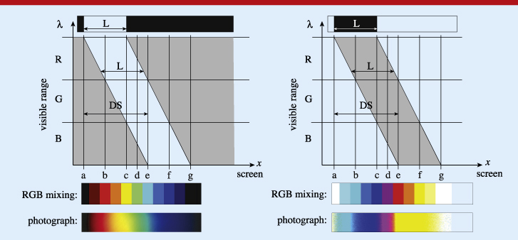
Figure 8. Comparison of Dispersion Diagrams for spectra from a slit (left) and obstacle (right) with width L<DS. From position a to b the RGB-values range from (0, 0, 0) to (1, 0, 0), i.e. darkness to red (left), and from (1, 1, 1) to (0, 1, 1), i.e. white to cyan (right). From b to c the RGB-values range from (1, 0, 0) to (1, 1, 0), i.e. red to yellow (left), and from (0, 1, 1) to (0, 0, 1), i.e. cyan to blue (right). In both cases new spectral conditions arise around screen position d corresponding to the appearance of green (left) and dark magenta (right). Between e and f the RGB-values range from (0, 1, 1) to (0, 0, 1), i.e. cyan to blue (left), and from (1, 0, 0) to (1, 1, 0), i.e. red to yellow (right). Between f and g the RGB-values range from (0, 0, 1) to (0, 0, 0), i.e. blue to darkness (left), and from (1, 1, 0) to (1, 1, 1), i.e. yellow to white (right). The Dispersion Diagrams reveal the general complementary structure of the wavelength distributions and both the RGB-simulation and the actual spectra show correspondingly complementary colours. Note that the width of the spectrum is DS+L.
Download figure:
Standard image High-resolution imageFigures 8 and 9 compare the progression of colours for the narrowing of slits and obstacles of equal width L. The modification of the respective edge spectra occurs basically in two steps:
- (i)the appearance of green in the case of slits; analogously the appearance of magenta in the case of obstacles (figure 8) and
- (ii)the disappearance of yellow and cyan in the case of slits; analogously the disappearance of blue and red in the case of obstacles (figure 9).
Again, both the Dispersion Diagrams and the actual spectra are complementary, because the original patterns are complementary. On the one hand, the corresponding Dispersion Diagrams would add up to the full set of wavelengths all over the screen. On the other hand, for every single screen position, the corresponding spectra display colours that are complementary to each other, yielding white in additive colour mixing. In other words, the spectra display complementary colours, which lie opposite to each other on a typical colour circle, i.e. in opposing directions from the point (x,y) = (1/3,1/3) in the CIE 1931 xy chromaticity diagram [7]. Note here that complementary wavelength distributions always yield complementary colours, but the reverse is not true. Metamerism allows for complementary colours to have wavelength distributions that do not add up to the full visible range of wavelengths.

Figure 9. Comparison of Dispersion Diagrams for spectra from a narrow slit (left) and obstacle (right) with L similar to or smaller than the width of the red section of the spectrum. For the slit spectrum (left), the wavelength distribution is a small portion of the visible spectrum. Accordingly, both in the simulation and in the actual spectrum we see basically red, green, and blue. In the complementary version (right), the wavelength distribution is characterized by the corresponding gap within the visible range. Consequently, the colours are complementary: cyan, magenta, and yellow. Again, the width of the spectrum is DS+L.
Download figure:
Standard image High-resolution image
7. Conclusion and outlook
We present an approach to the realm of prismatic colours based on an diagrammatic analysis of the wavelength distribution within spectra from slits and obstacles of varying geometry. Prismatic colours are then derived from the wavelength distribution by means of a simple RGB-mixing procedure. The discussion of the resulting colour phenomena avoids the common confusion of colour and wavelength, makes the occurrence of well saturated colours within edge spectra comprehensible, and nicely supplements the exploration of colour mixing from broad-banded light sources [8].
Both the underlying monochrome images and the spectral distribution on the screen can be straightforwardly demonstrated in experiments using narrow-band filters, or orthogonal dispersion. In our modern experimentum crucis, the actual colours of spectra may be directly compared to their wavelength composition in terms of red, green and blue components. Using a corresponding RGB-mixture will simulate these colours quite accurately. Our RGB approach is simpler than calculating colour coordinates within the CIE chromaticity diagram, making it suitable for high school level students. In this framework it is also straightforward to understand the colours from edge spectra, the colour phenomena related to narrowing the slit width, and the complementary relationship of colours from homologous slits and obstacles in spectroscopic setups.
Prismatic colours provide a fascinating and rewarding field of enquiry both under the perspective of technical applications and aesthetics. With the availability of computers and video projectors, it is very easy to perform impressive experiments. Therefore, we strongly hope that the topic experiences a renaissance in physics classrooms. In addition, within the modern reception of Newton's theory there are two problems that we plan to address with our approach.
- Following an argument of Holtsmark [9], it was demonstrated that Newton's experimentum crucis can be contrasted with an inverted version: in a bright room, cyan, magenta, and yellow lights are refracted to the same degree as their respective complementaries in Newton's dark chamber, thus breaking the link between refrangibility and colour [10, 11].
- Generalizing the complementarity of Newtonian and Goethean spectra, the Austrian painter Ingo Nussbaumer obtained geometrically equivalent, yet differently coloured, 'irregular' spectra from a coloured slit image in a complementary-coloured surround [12] (e.g. yellow slit with blue surround etc), thereby demonstrating that the refractive behaviour of colour depends on the surrounding colour.
Both problems involve fascinating and colourful experiences and pose intellectual challenges that recommend examination within physics classrooms. In this context we will show further applications of the RGB approach and further variants of experiments with 'double dispersion'.
Biographies

Florian Theilmann studied and taught physics at Waldorf schools in Germany and Switzerland. From 2007-11 he worked in physics teacher training at the University of Potsdam, Germany. Since 2012 he has worked as an assistant professor at the University of Salzburg, Austria.

Sascha Grusche studied physics education and English at the University of Potsdam and teaches at a high school in Potsdam. For his master's thesis he developed experiments and a course on prismatic colours.